|
|
|
|
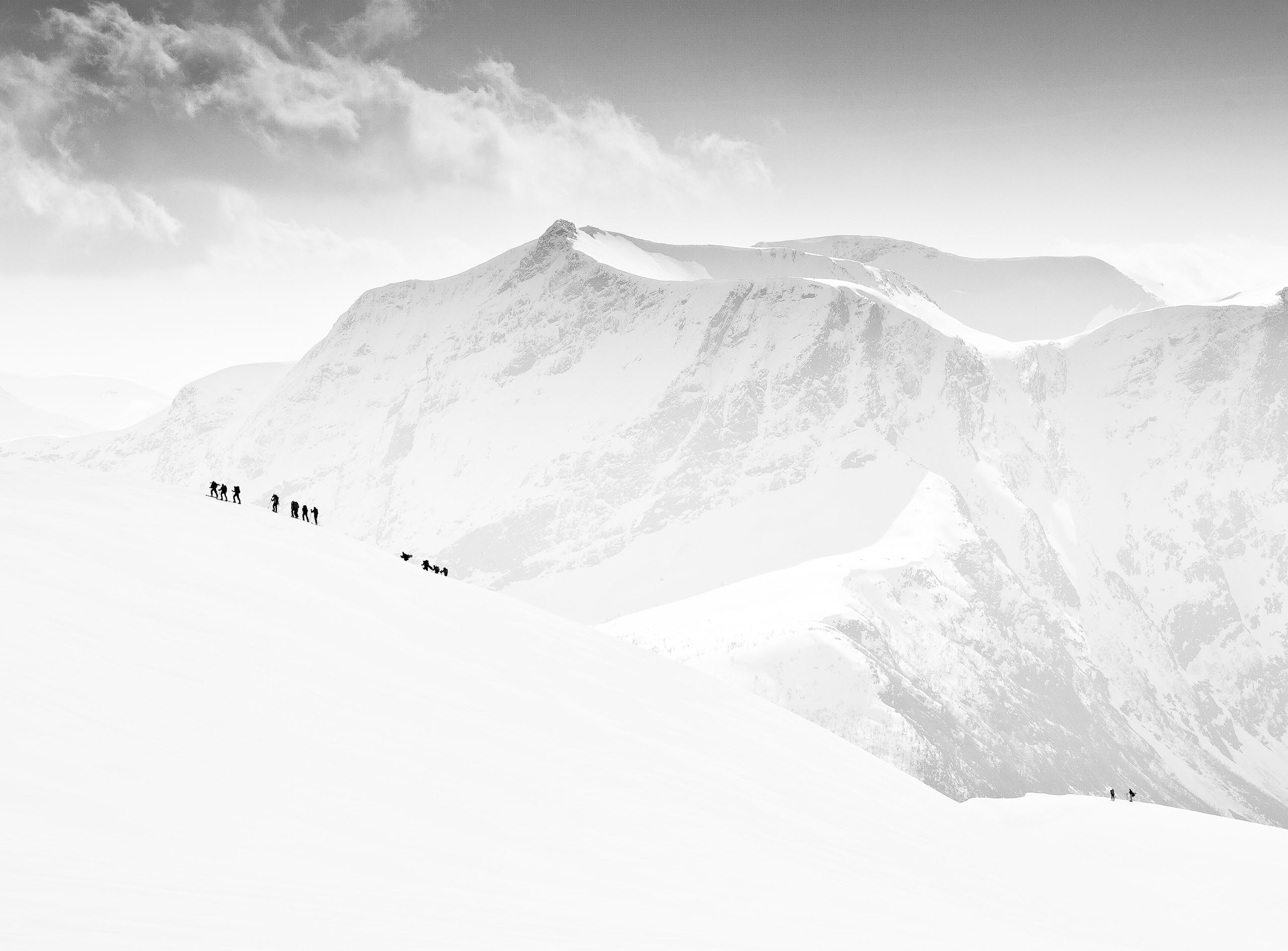
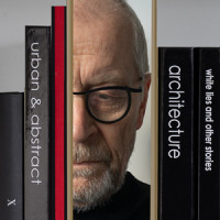
by Editor Peter Davidson
Edited and published by Yvette Depaepe, the 1st of April 2026
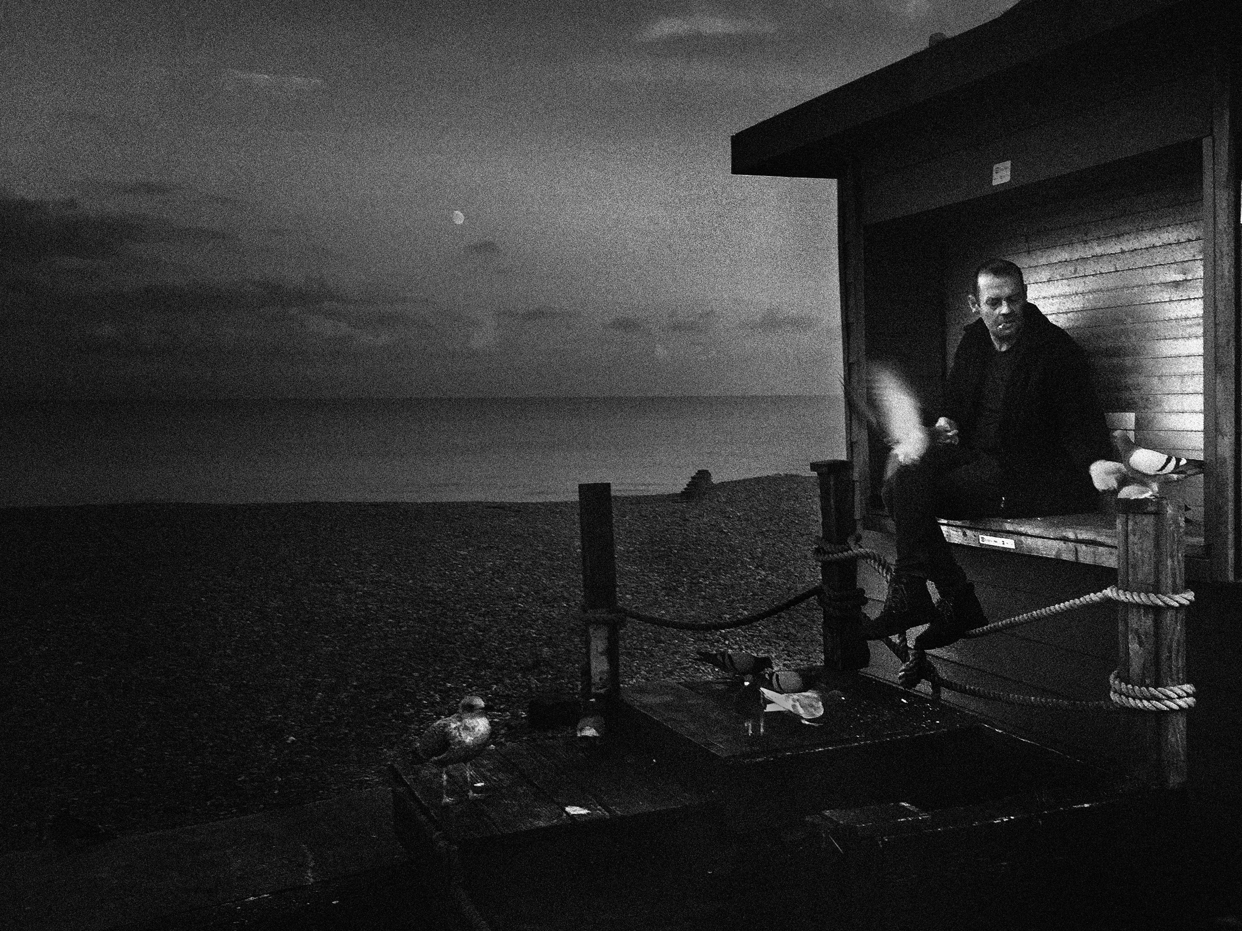
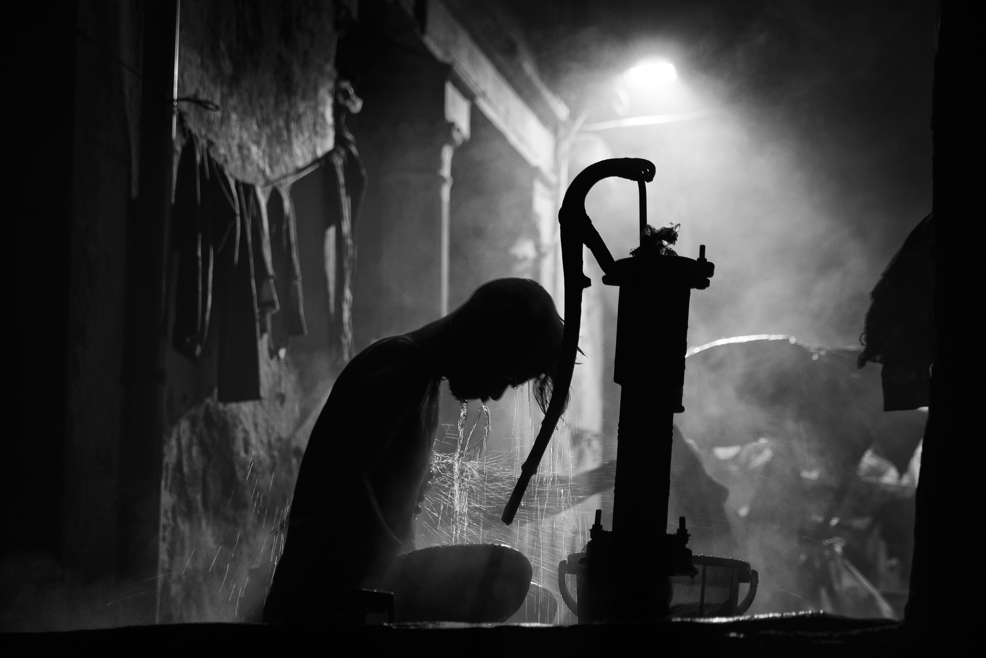
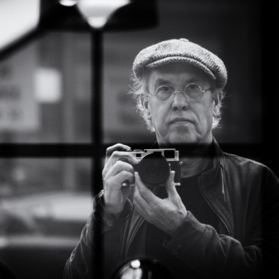
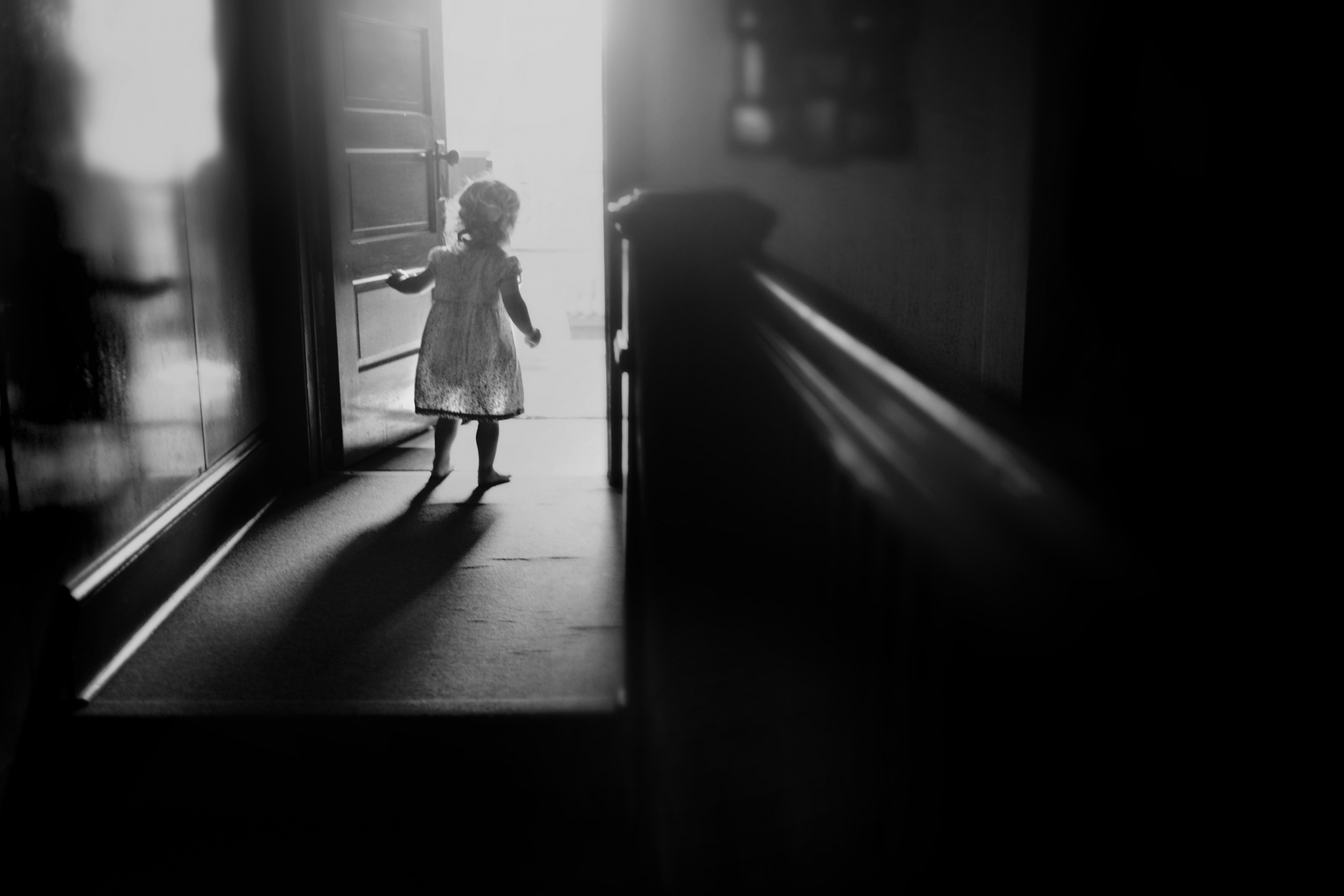
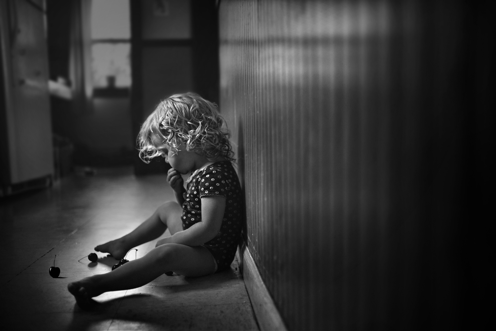
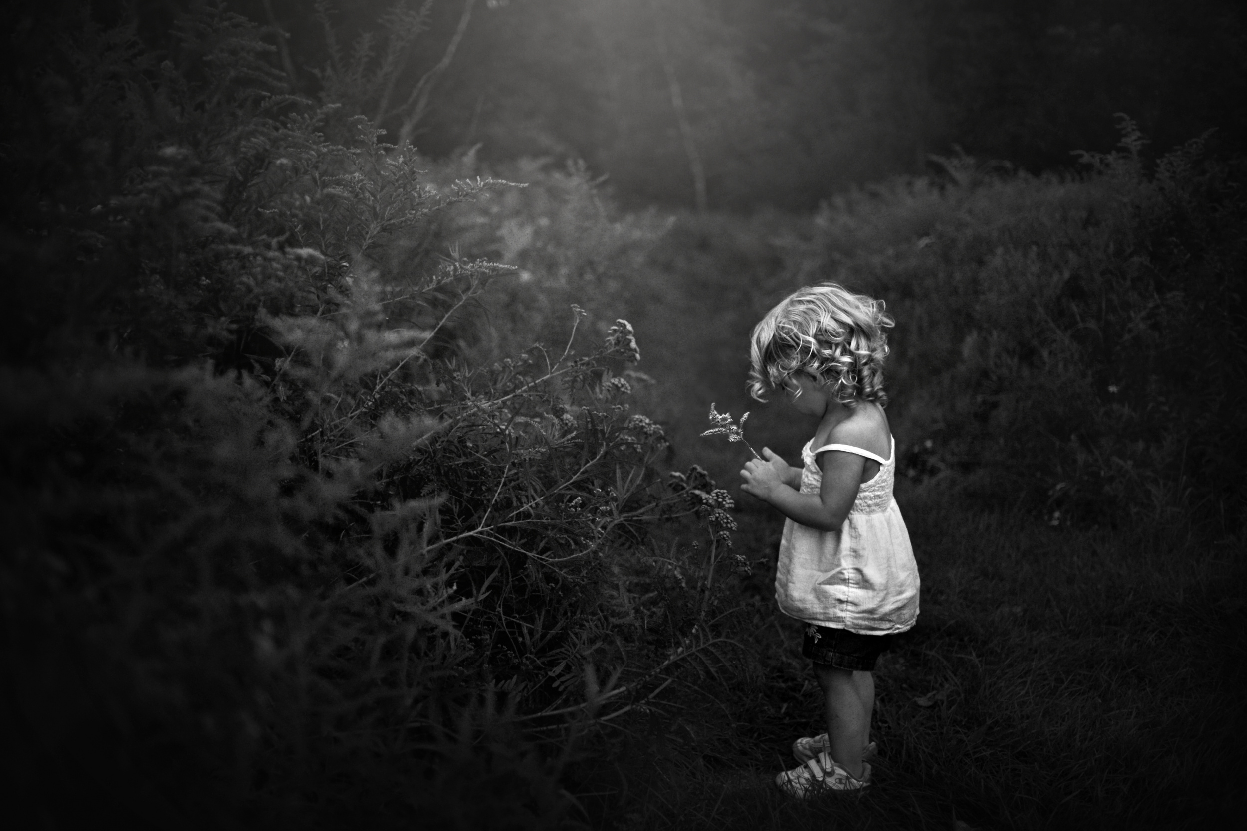
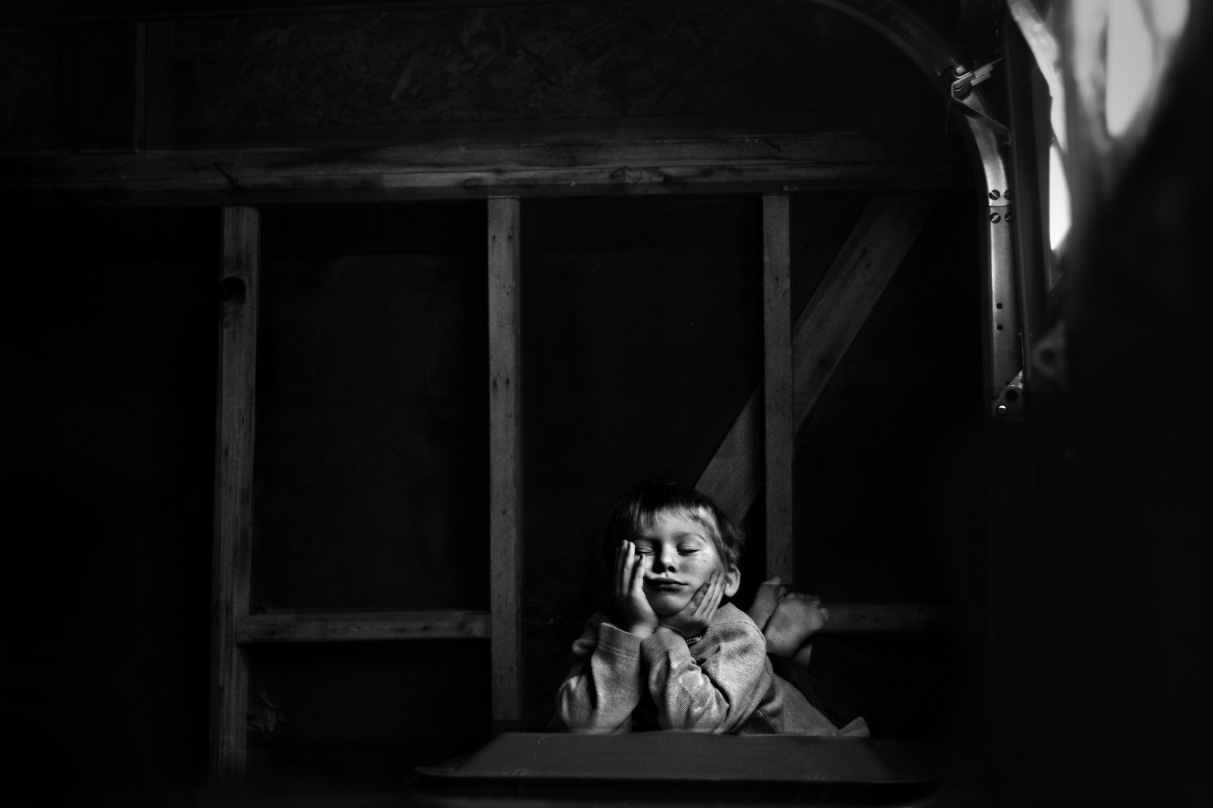
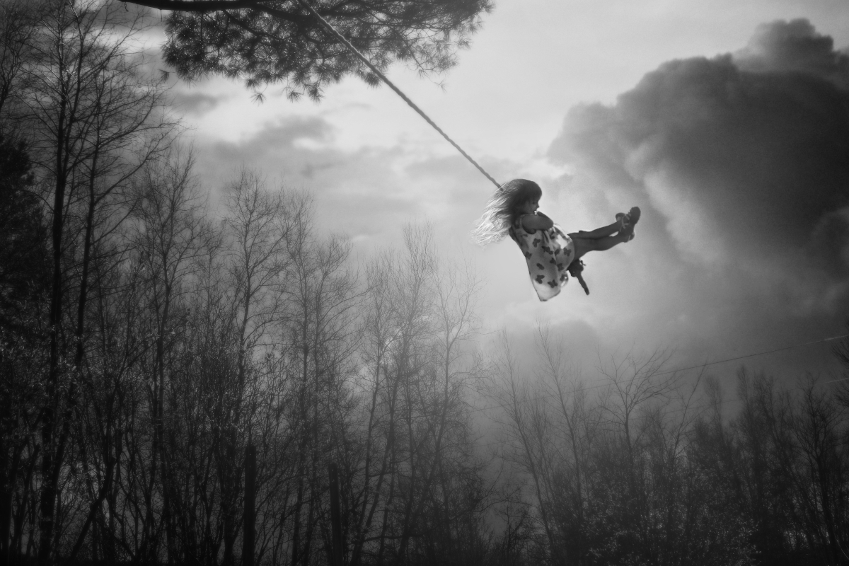
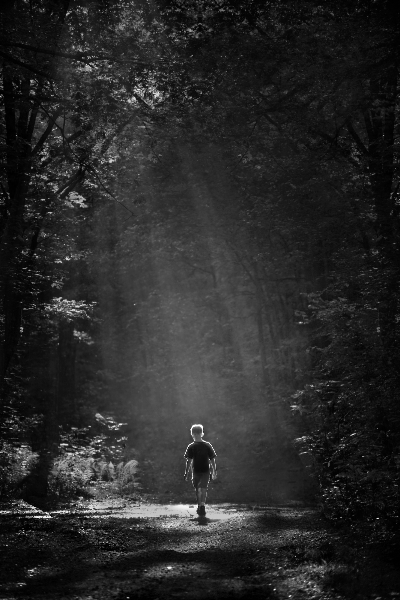
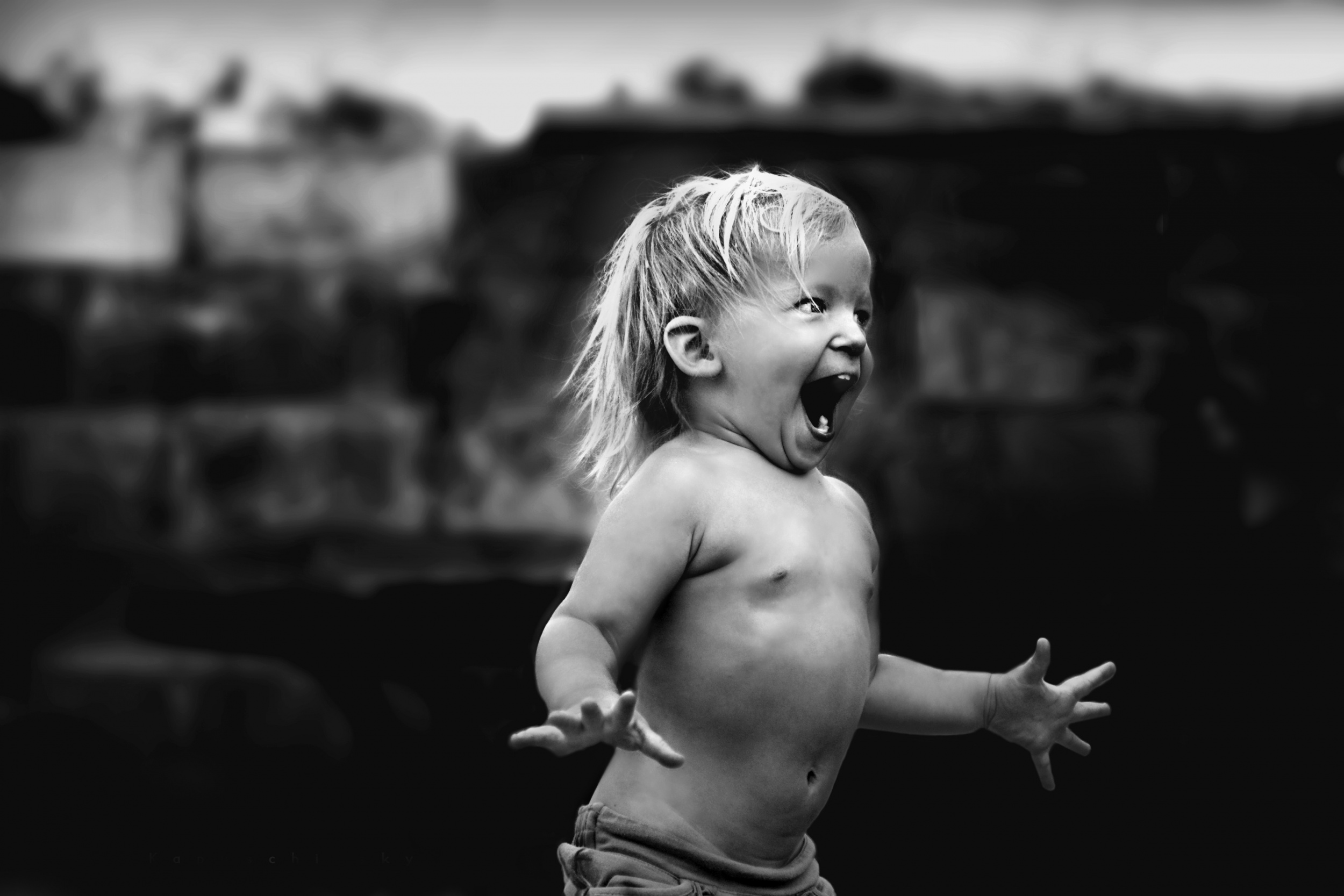
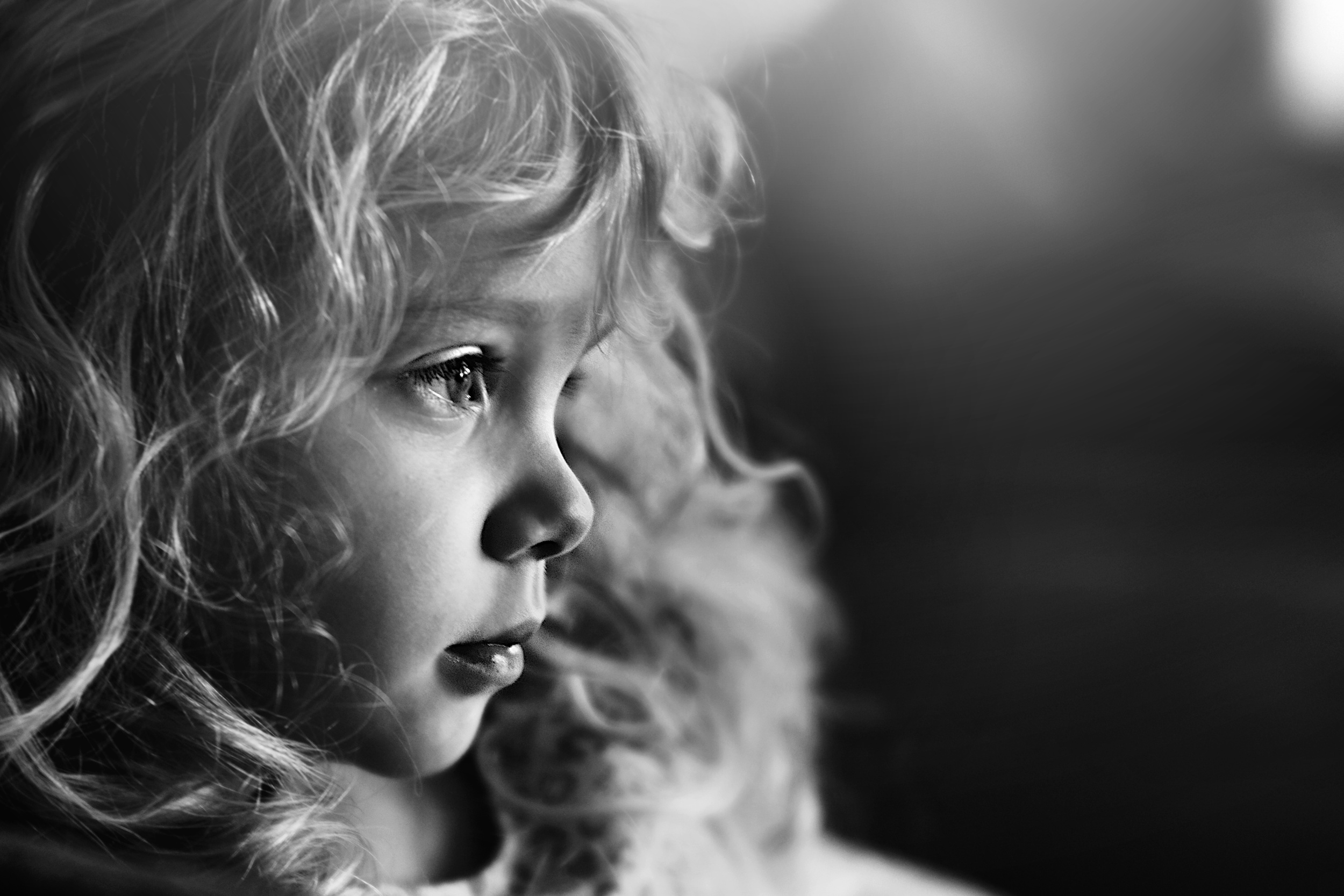
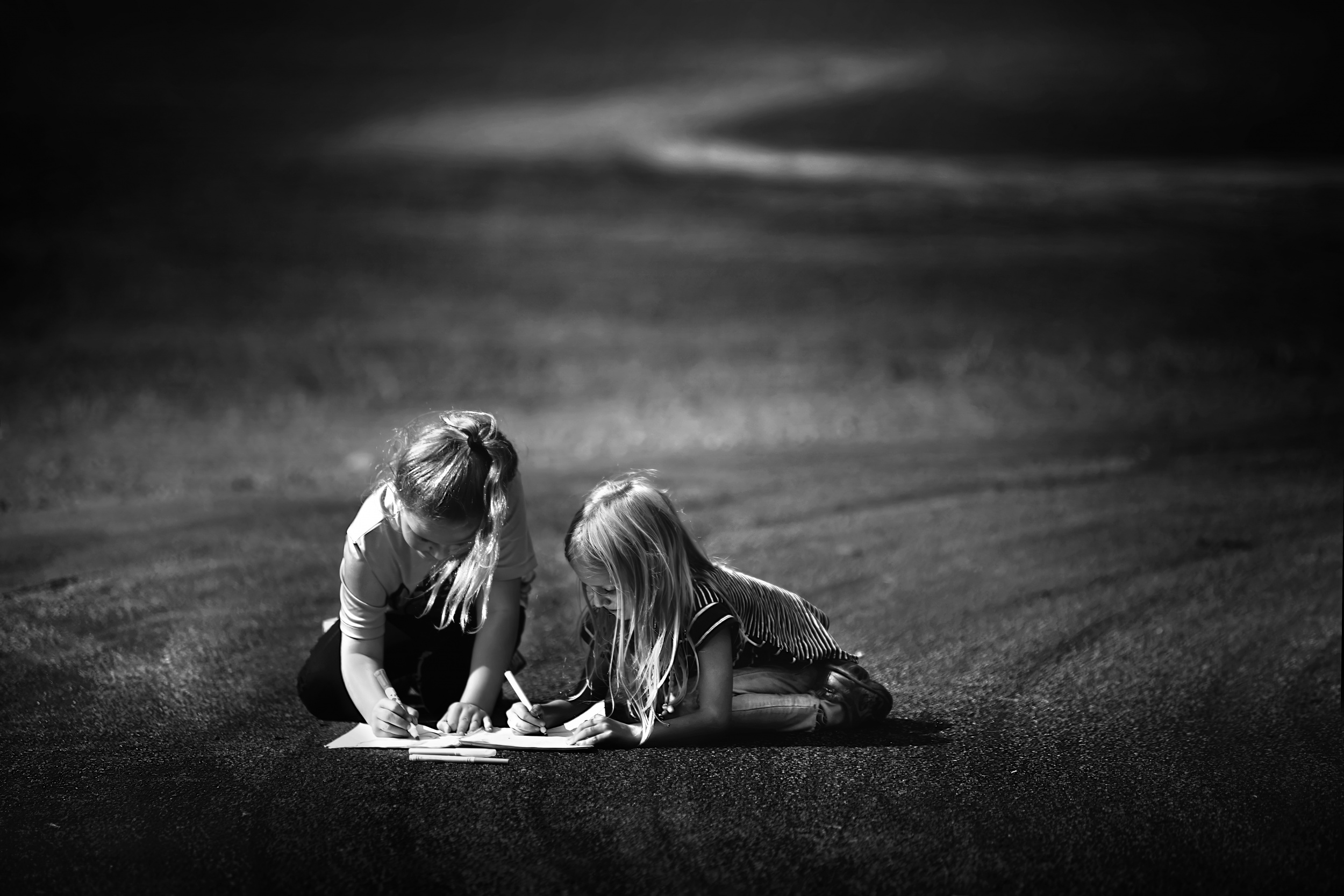
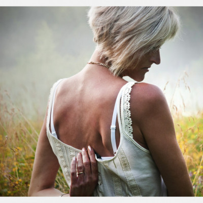
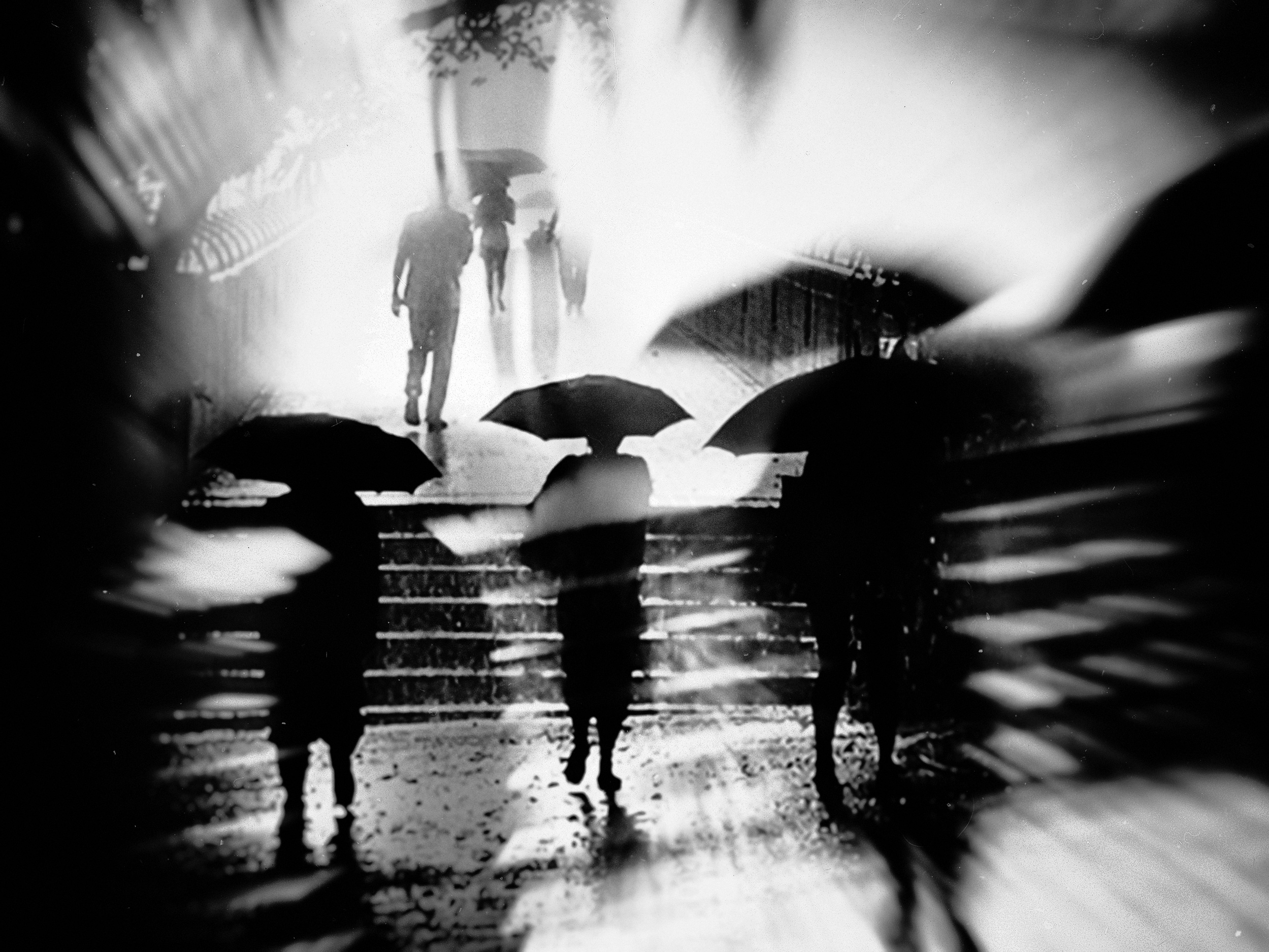
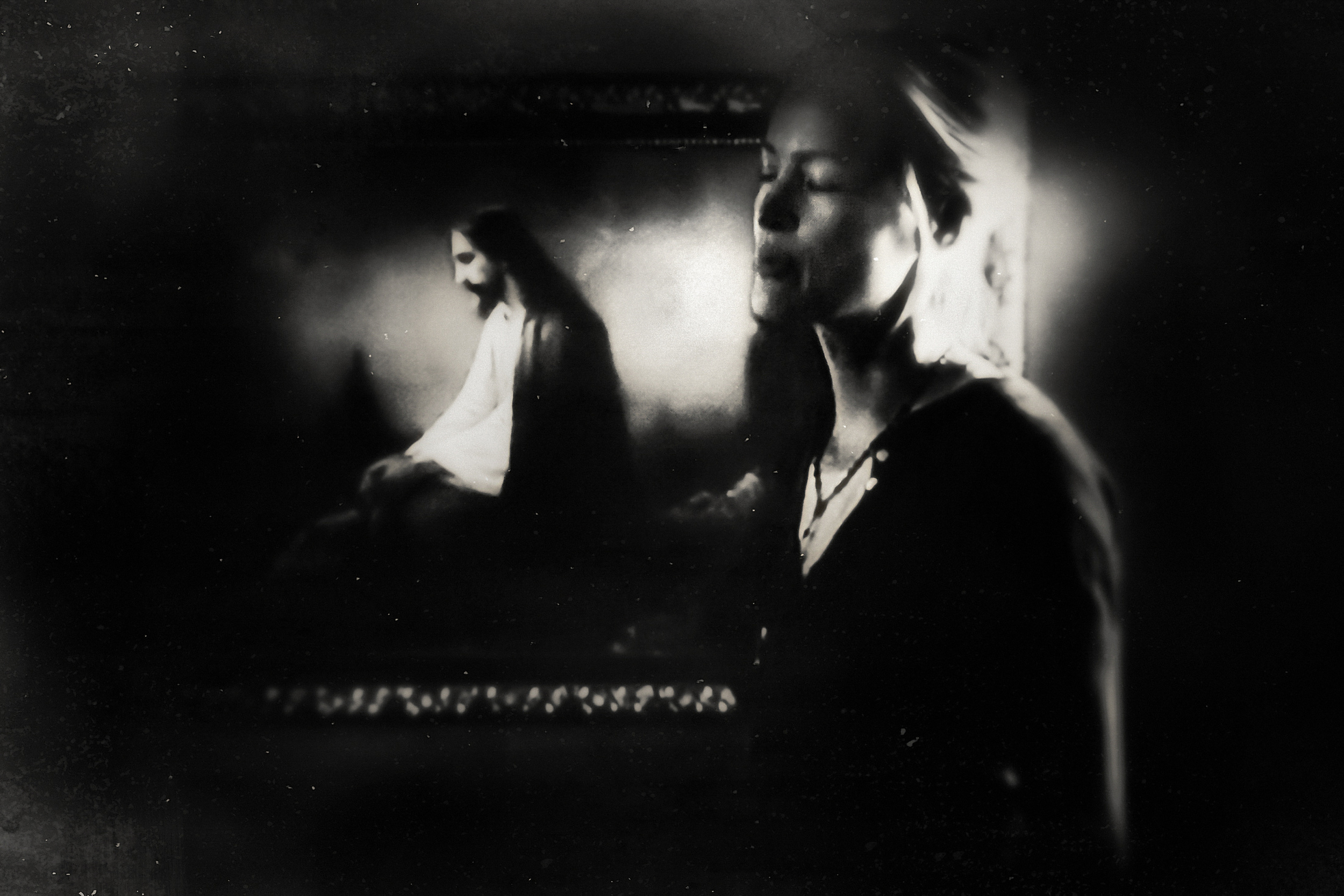
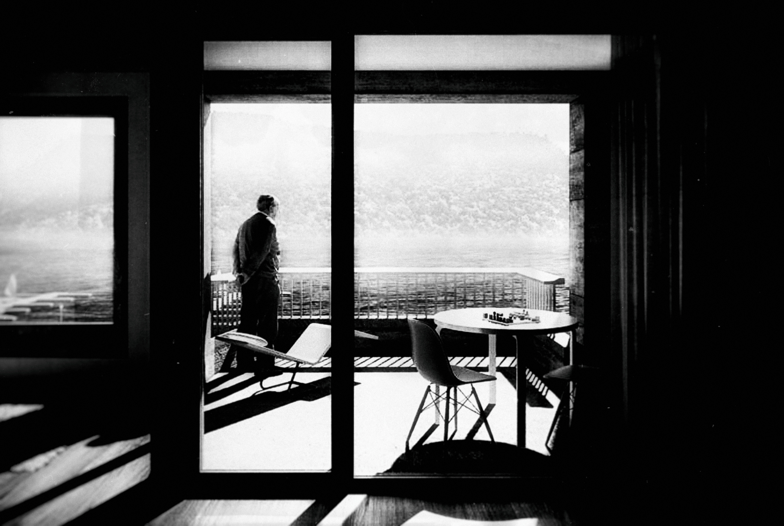
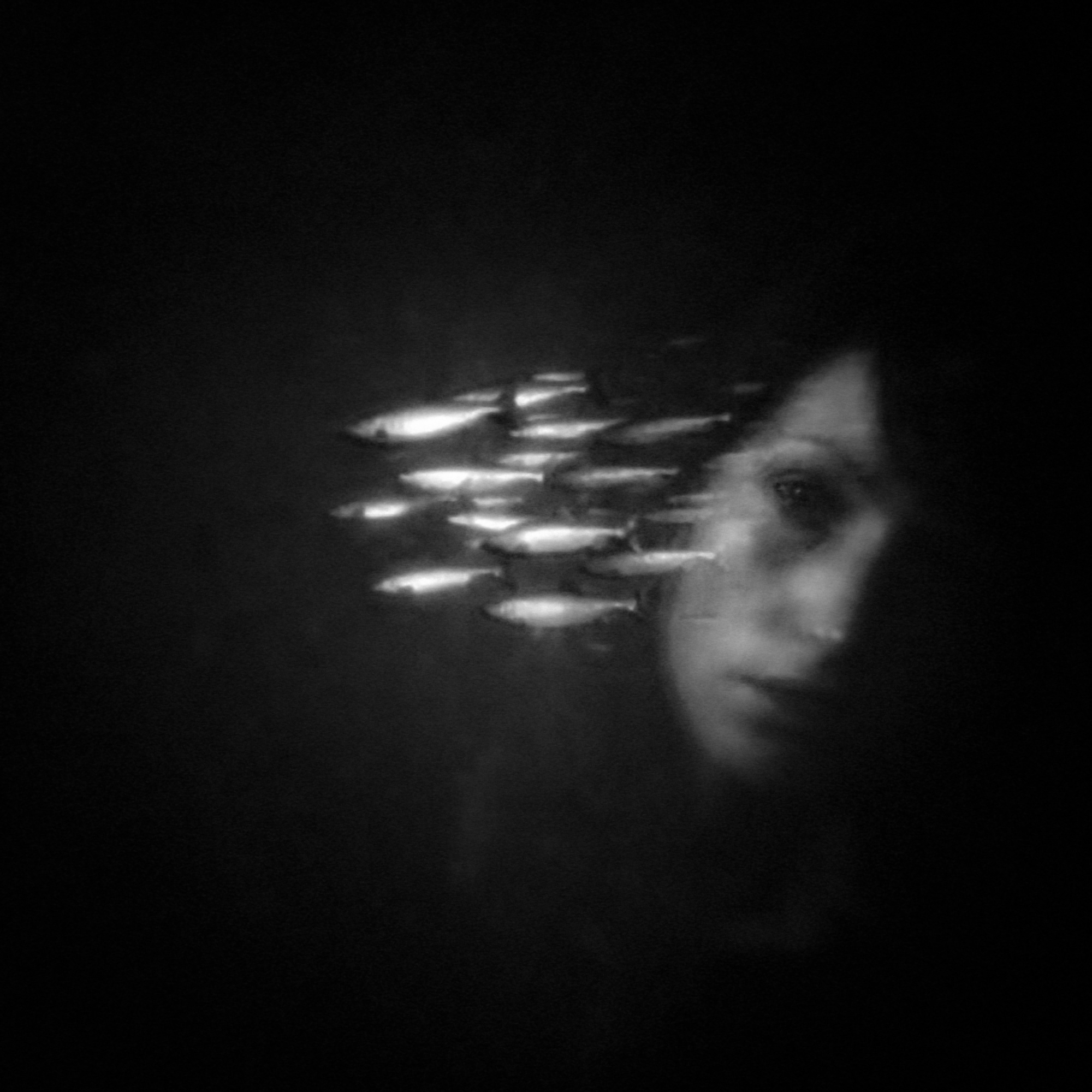
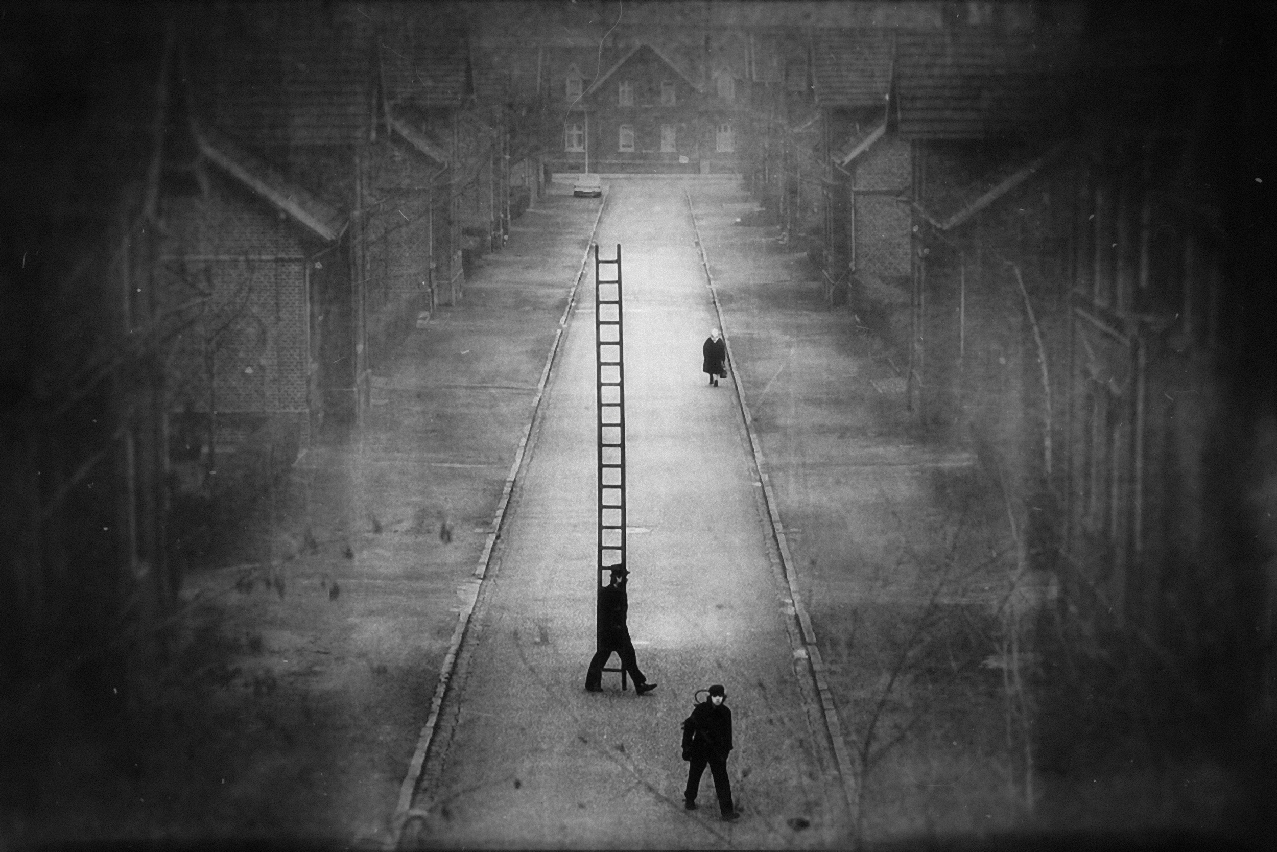
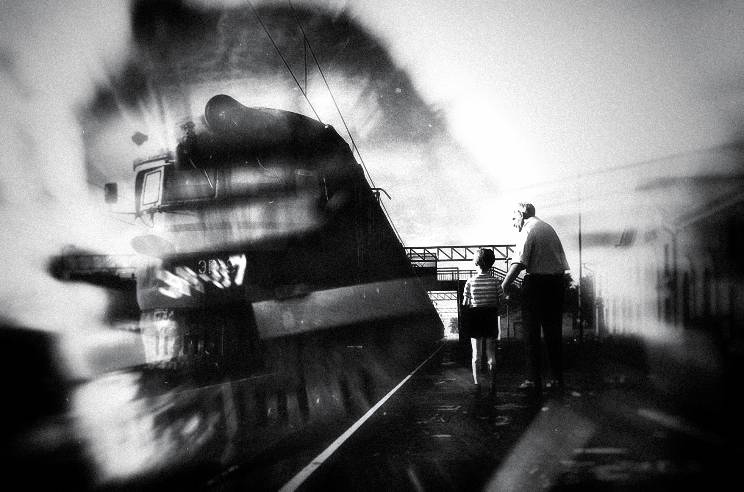
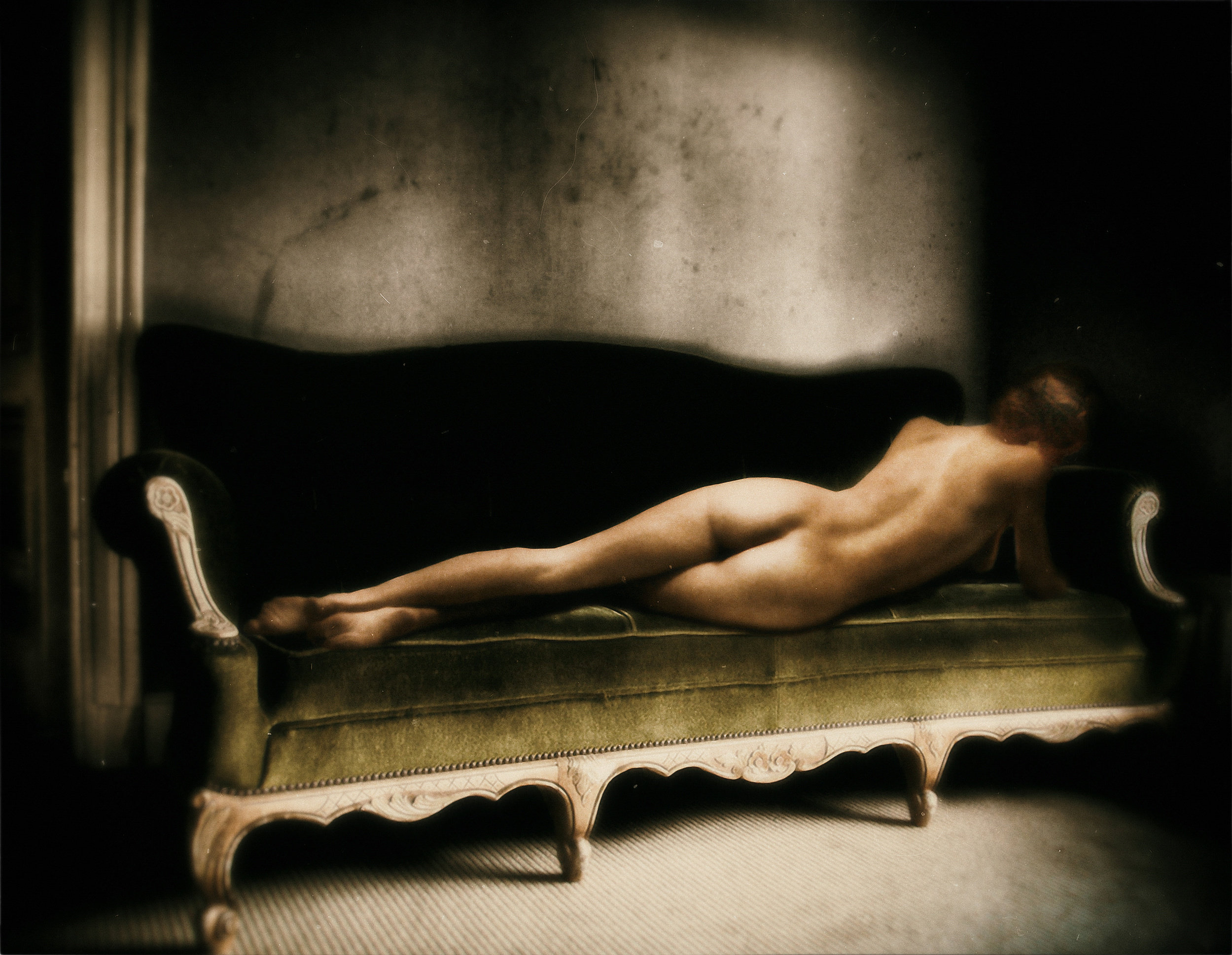
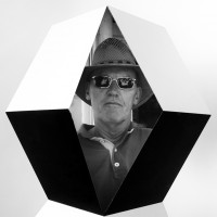
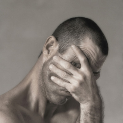
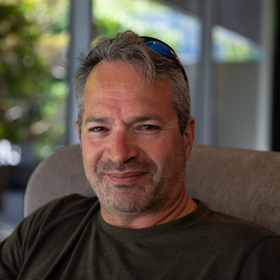
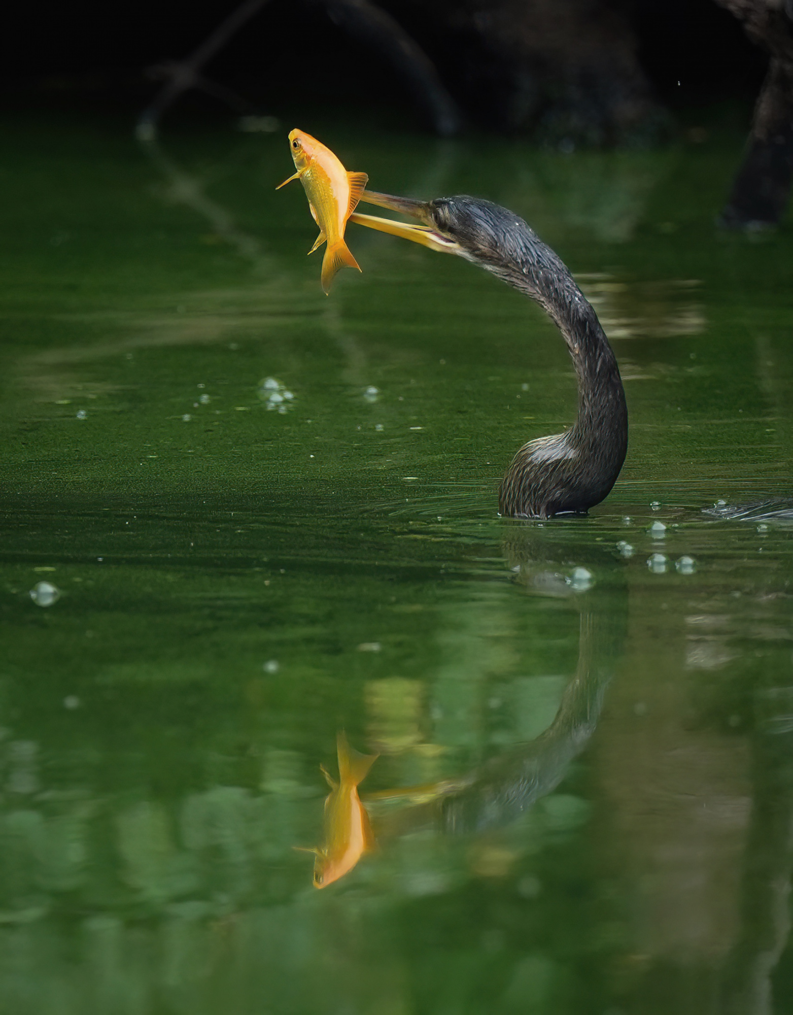
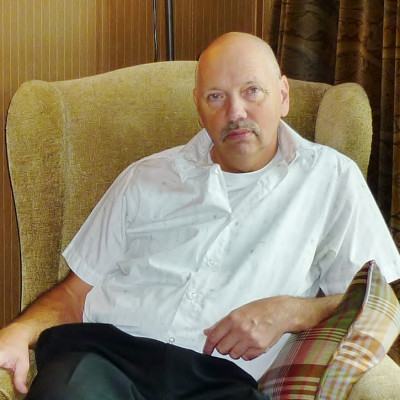
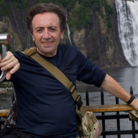
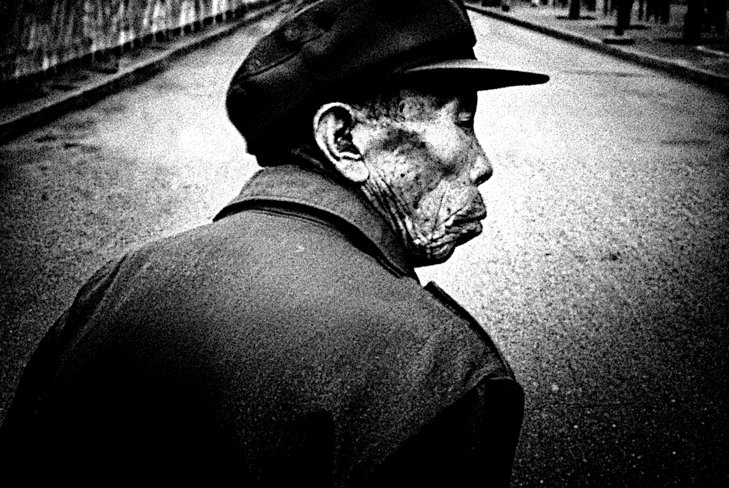 Candid shot taken on an old phone camera.
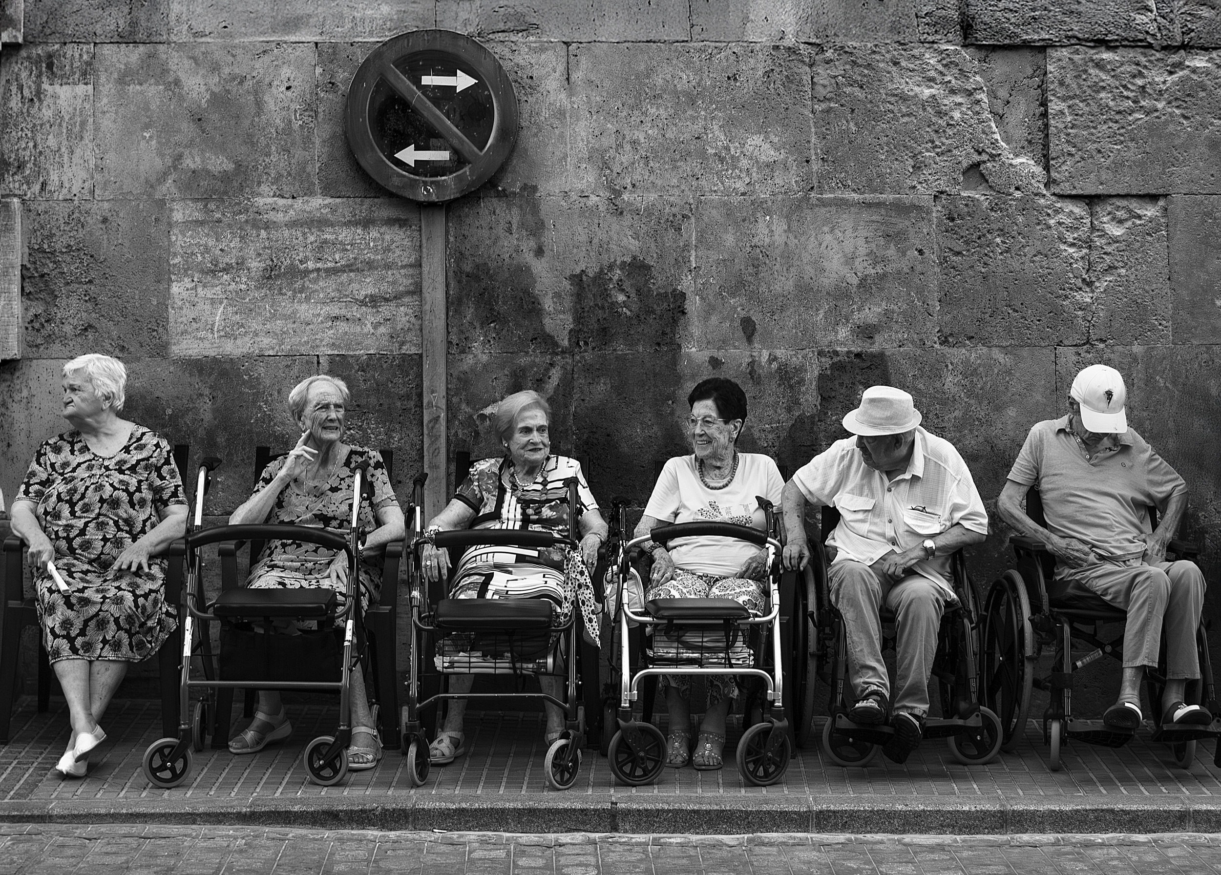
Recently I was intrigued by the surprising (to me) revelation that professional musicians rarely bother listening to high end Hi-Fi music at home. They seem perfectly content to listen to music from whatever device happens to be around, be that a small transistor radio or ear buds from a phone. It doesn't matter much, if at all.
Back in the day when there were only two channels of TV and radio for entertainment, it was different. The stereogram and later, Hi-Fi separates, were the 'main thing' in a home. Any self-respecting living room or student flat was incomplete unless it had two very substantial speakers and a rack of high tech audio gear prominently on show. Of course, this sort of thing is still around, but tends to be seen only in rooms of the dedicated (and wealthy) audio enthusiast.
However, and here's the thing, the aforementioned audio enthusiast is highly unlikely to be an actual musician. Musicians, for the most part anyway, seem not to care very much how technically beautiful the recorded music is actually reproduced or sounds.
What they do care about, is not how well the recording is reproduced, but how good the music is, how it feels, regardless of how the recording is being reproduced. In other words, what is really important, is how well it moves people emotionally.
Personally, I can remember years ago now, how amazing it felt when listening to certain songs through a small and tiny sounding transistor radio, fading in and out and crackling with static. None of that 'snap and pop noise' mattered a jot. The music just came through in an emotional wave, and bam, hit me and millions of others like me, in the emotional gut. It lives within me to this day. Hearing those songs, I'm instantly transported back in time. Not once did I think the music in any way 'rubbish' because it wasn't reproduced in hi-fidelity.
I think you can guess where I'm going with this. Here on our little community, there are photographers with exquisite technique producing exceptionally polished results every day. The question I'm asking is, apart from impressing other photographers, are we somehow missing the point?
The people who actually buy our photographs, I suspect, couldn't care less how technically perfect the image is. Or how expensive the camera or lens was. It's all pretty much irrelevant to them. Not always of course, but mostly. But, I hear you say, what about 'image quality'? Good question...
Without getting deep into a can of worms regarding subjec tivity, the most important aspect of any photograph I would argue - and it's much like music in this sense - is in how a picture makes you feel.
The other day, when by chance I passed a poster of a 1930's New York cityscape enlarged to wall size, and not even a good reproduction, I was struck by that thought. Because that image itself was technically pretty terrible. Not sharp, marked and scratched, but still emotionally powerful. Smoky, raw and just... overall brilliant. To hell with the technicalities, it was great. For me anyway. And many, many others too, because it has and still is, reproduced thousands of times.
The moral, if you want a moral, is the pursuit of the sublime in a technical sense is perhaps not all that we as photographers should always be striving for. We are, after all, very much like musicians in a sense. Like musicians, we strive to make our images resonate. To be felt and remembered. To have impact. What that impact is, and how it resonates, is of course, for you to create. Yet how that image is made and by what means, no one (apart from us) really cares.
It's the result that matters most, and it's to those that matter most, the people who share the connection. And sometimes back that up by purchasing the image. Having said that, I've yet to sell a single one of the images here that I show as part of my argument! Regardless, I'll carry on trying to make some sort of connection with my viewer. Or maybe I'll just get my coat...
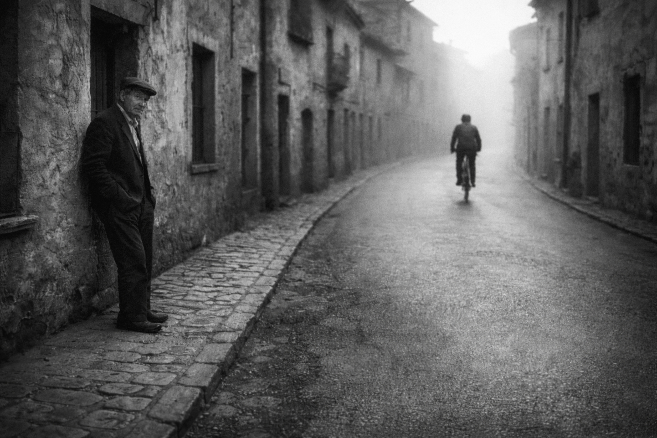
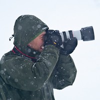
I've struggled to find examples of lo-fi images on 1x - for obvious reasons - so forgive me if I've resorted to using just three of my own. Higher IQ images from other photographers follow.
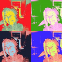
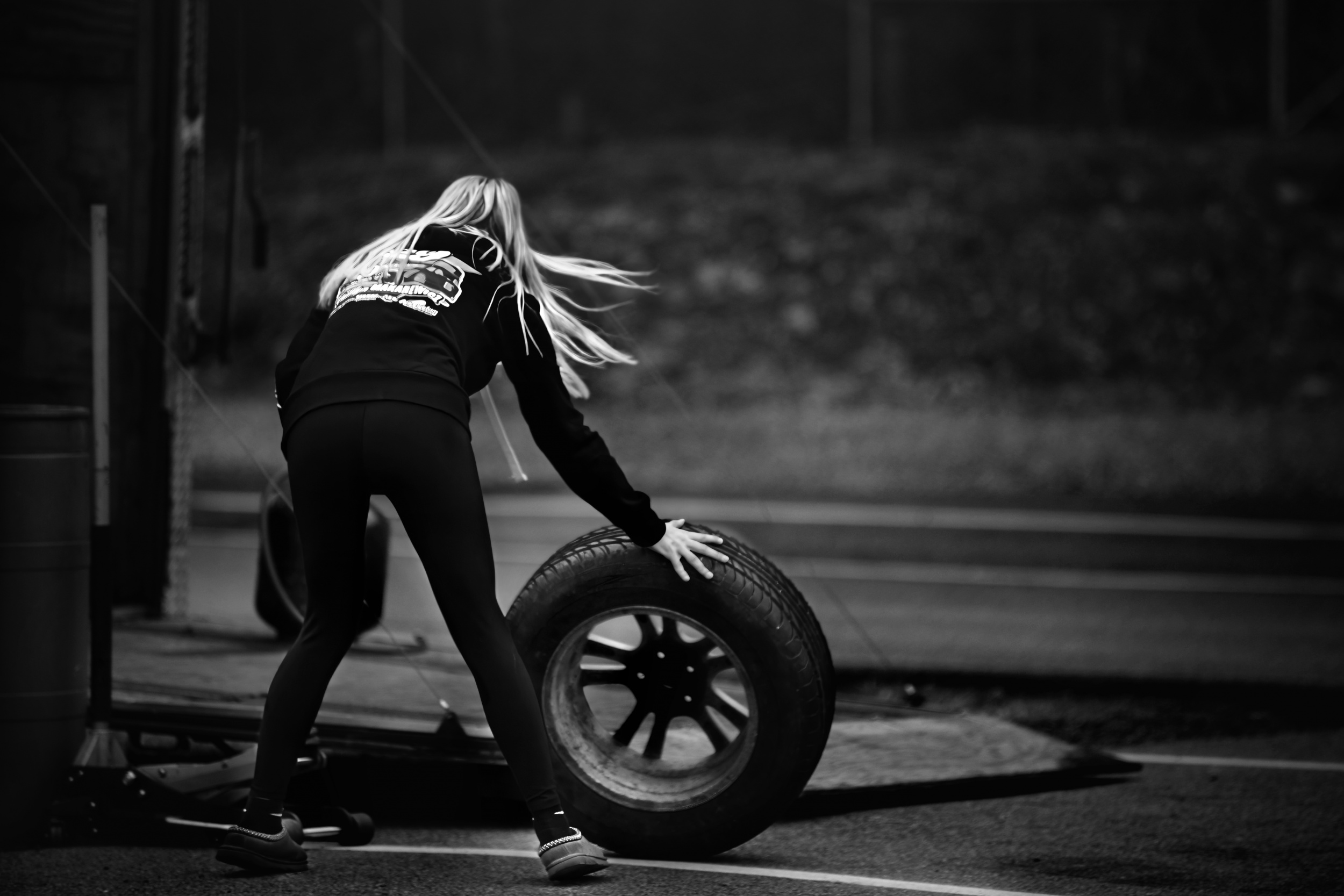
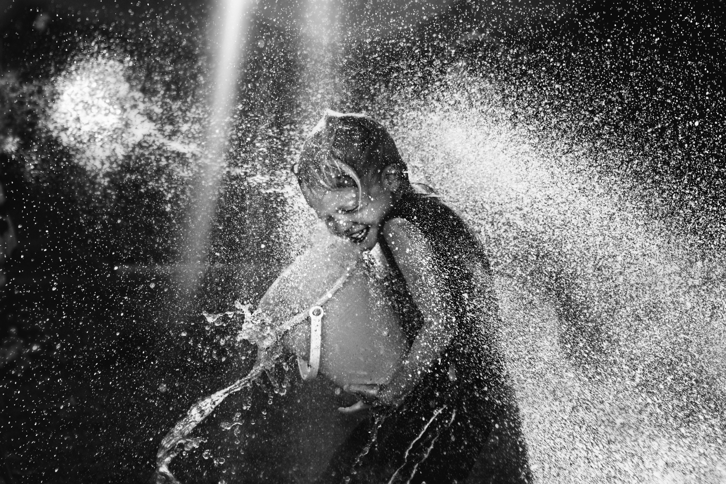
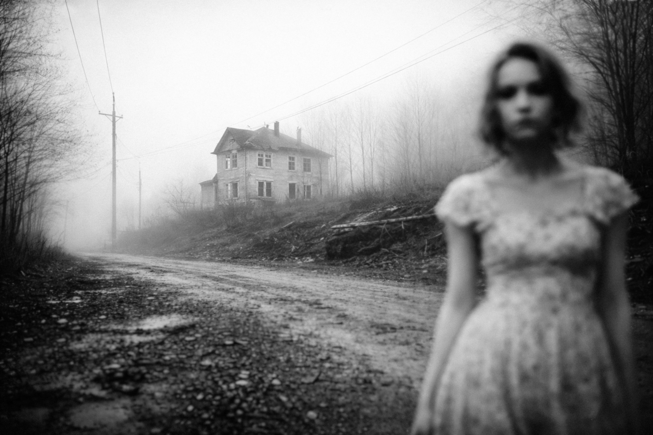
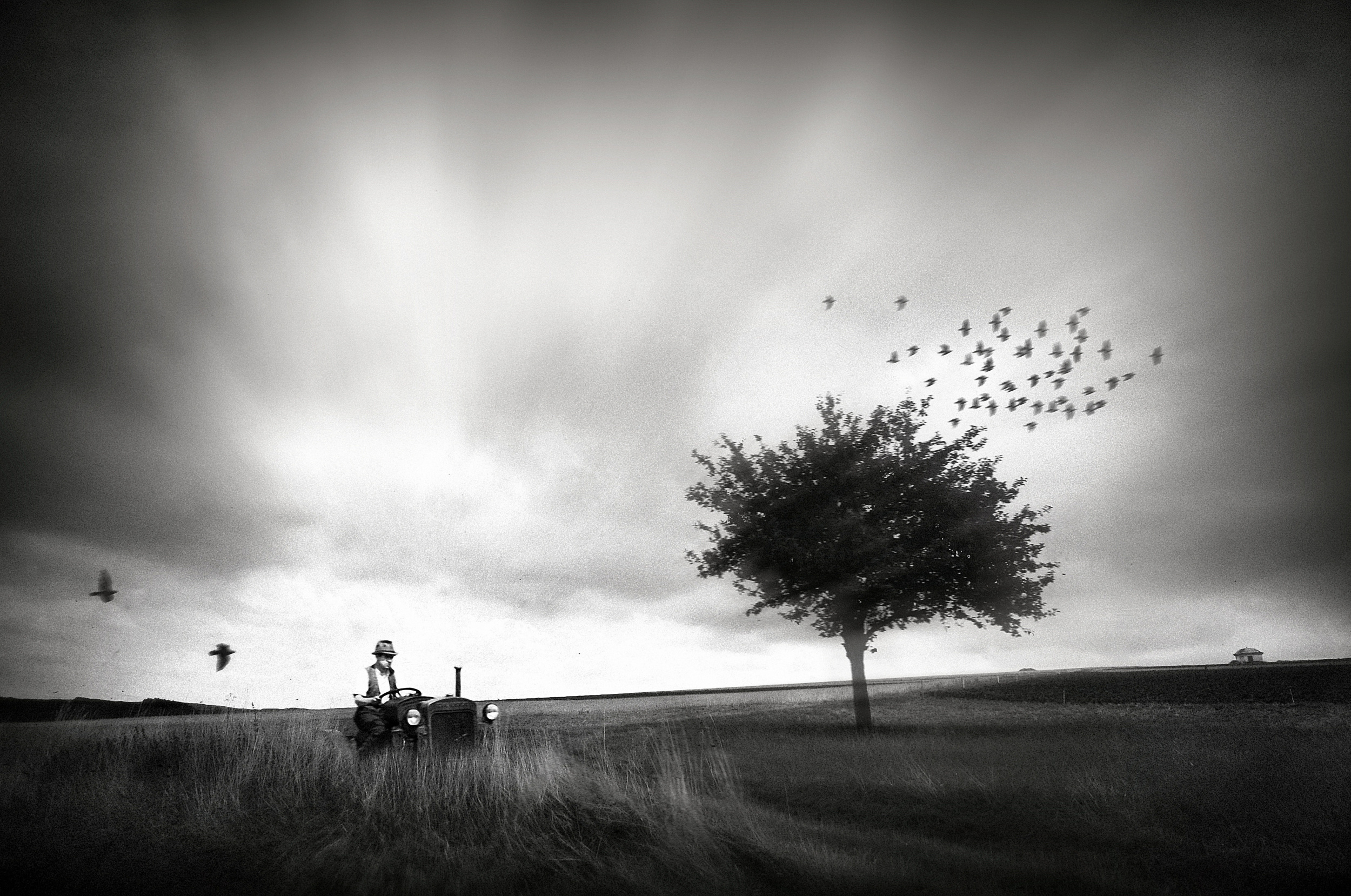
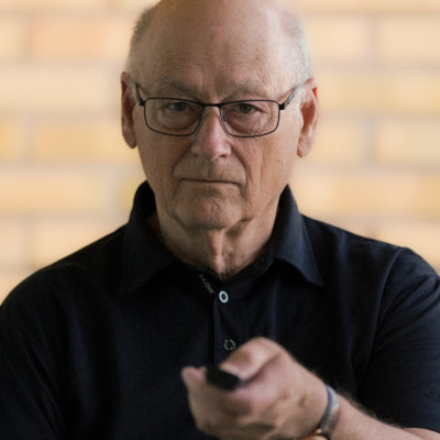
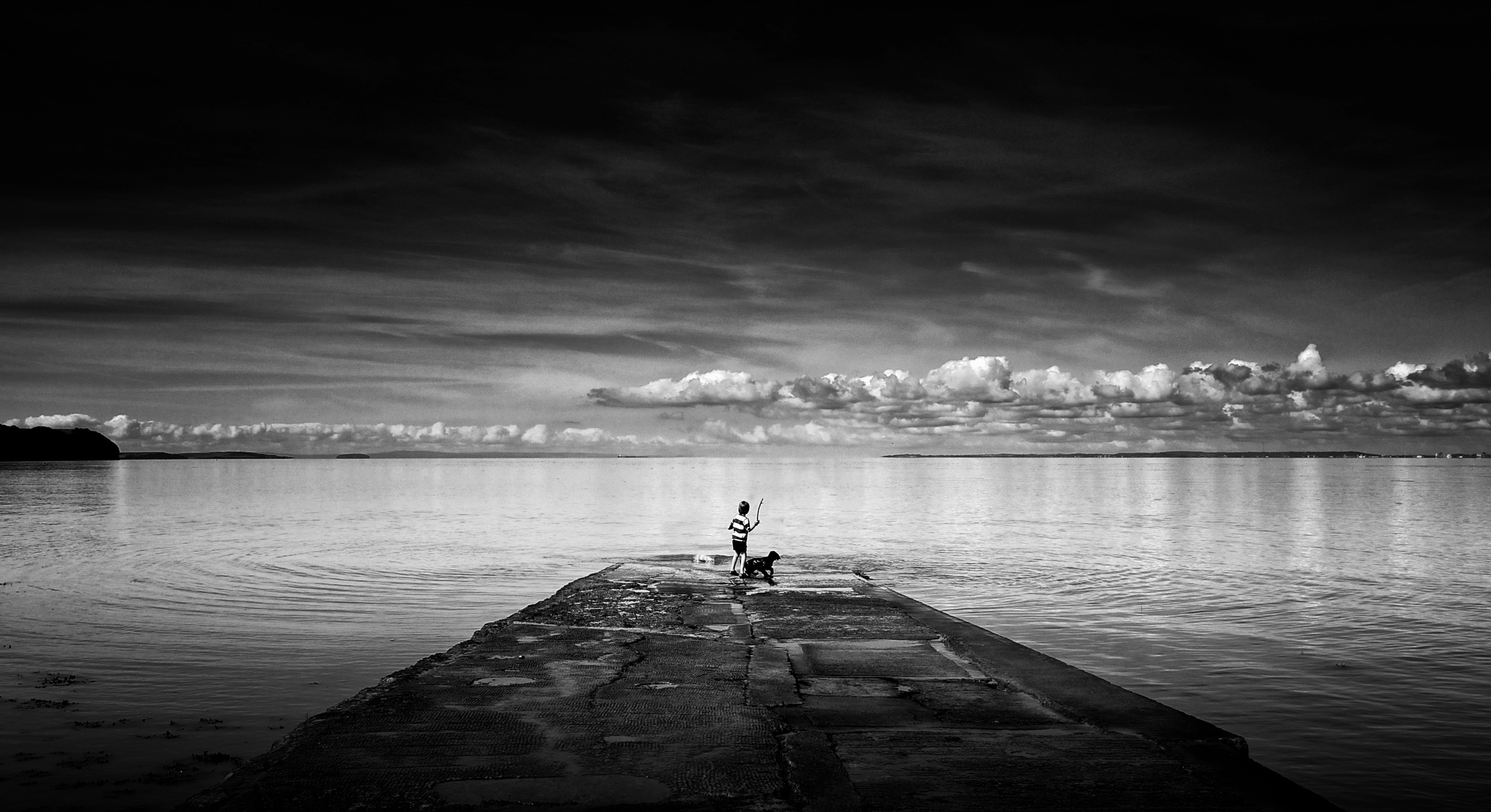 Taken using an old 3mp camera
 | Write |
 | Eiji Yamamoto PRO Dear Peter, thank you so much for your wonderful article! Dear Yvette, thank you so much as always! |
 | Hans Martin Doelz CREW Photography didn't begin as a language of perfection. Its original power lay in its imperfections: blurriness, imbalance, unfavorable composition, technical limitations. These flaws weren't mistakes, but opportunities. They allowed room for ambiguity, interpretation, and tension. Imperfection created space for meaning to emerge, rather than imposing it.
If an image is too perfect, it closes itself off. Every decision seems justified, every element optimized. There's nothing left to question. The photograph becomes self-contained, immune to interpretation. It may be impressive, but it remains silent.
Photography does not become meaningful when it confirms what we already know, but when it unsettles perception. When it resists immediate clarity. When it demands time rather than attention. The perfect image may impress, circulate, and perform well. But it seldom stays in our memory.
Thanks, Peter ! |
 | Jivko Nakev PRO |
 | Jane Lyons CREW Thanks Peter, a much appreciated reminder! |
 | Behlul Ucar PRO After all, the world itself is not a perfect place. Why should art be? |
 | Miro Susta CREW Excellent write up Peter, you are right, not always the perfect quality makes perfect photos.
The content and attractiveness are very important.
Now I understand much better why my old photo which I captured with my symple analog Minolta many years back in old Singapore was published in 1x gallery. This photo is a documentary from nomore existing part of Singapore, as I said not of best quality butinteresting for many Singaporean and also visitors.
I am sure that such photos will survive without any compicated and expensive postreatnemnt and AI.
Once more thank for bringing to us this important subject. .
|
 | Steven T CREW An important reminder. I'm sure most of us have favourite photographs we made with basic gear. Many of the images I make with my thousand dollar lenses are 'exquisitely sharp - but dull'. Thank you, Peter and Yvette. |
 | Angelika Vogel PRO A special, impressive Portfolio, taken in the best moment! Congratulations and thank you so much for these spectacular photos! Thank you so much too to you dear Yvette! |
 | Tony Galvin PRO Bless you Peter. Just what an old Led Zeppelin (LP) fan needed to hear. You saved me a fortune on new gear. Maybe I'll invest in high-end vinyl system instead. Thanks |
By Yvette Depaepe
Published the 30st of March 2026
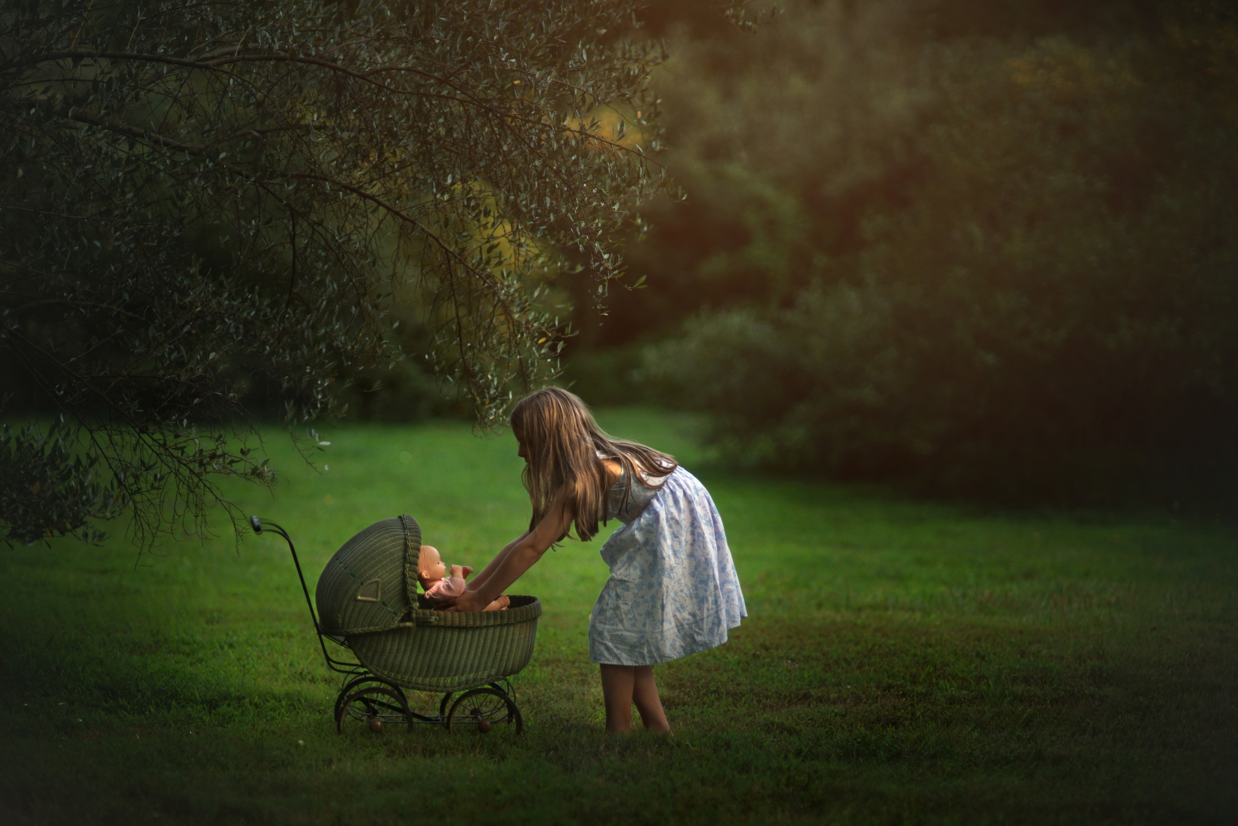
For Christine - Kapuschinsky, photography is an extension of her passion for creation. She says: “If I’m not creating, I feel like a part of me is starving.” Strong words from a strong and beautiful personality. Her children's photography is exceptional, inspiring and beautiful. She is drawn to child photography because the innocence, unlimited curiosity and sincerity of children move and affect viewers in ways that nothing else can. Christine also makes a huge statement that we should all consider primordial: “In this oversaturated digital era, where our youth are becoming increasingly addicted to screens, I am continually reminded of the importance of reminding people that this lifestyle robs children of the essence of childhood. Let them be kids.” Whatever Christine creates, her only goal is to move the viewer. And she succeeds!
Join me on a fantastic journey through her photographic world.
‘Transient’
Dear Kapuschinsky, first I would like to thank you so much for taking the time to answer this questionnaire! To begin, please introduce yourself shortly and tell us more about you, your hobbies or other projects you are involved in!
Thank you so much, Yvette! My name is Christine, but I use my maiden name, Kapuschinsky, for my artwork and photography, as a way of paying homage to my father, who sparked my love of and pursuit of photography many years ago. I have been married for 22 years, and we have seven children, with another on the way. They are my muses and were a huge source of inspiration when I first became serious about photography in 2012. At that time, we were still living in Southern California, and while enjoying the eternal sunshine, I learnt how to take pictures in the most difficult and harsh natural light conditions. This was a huge step in developing my style, particularly emotive monochrome imagery, and experimenting with utilising light effectively and dramatically.
When I'm not taking photos or editing them, I'm usually supervising the children's home schooling, going on hikes with them and our German Shepherd, or looking for ways to make our home more comfortable and efficient for everyone. We also have a hamster, a bug terrarium, and dozens of freshwater fish, so life here is like the Family Circus comic strip! There's never a dull moment here!
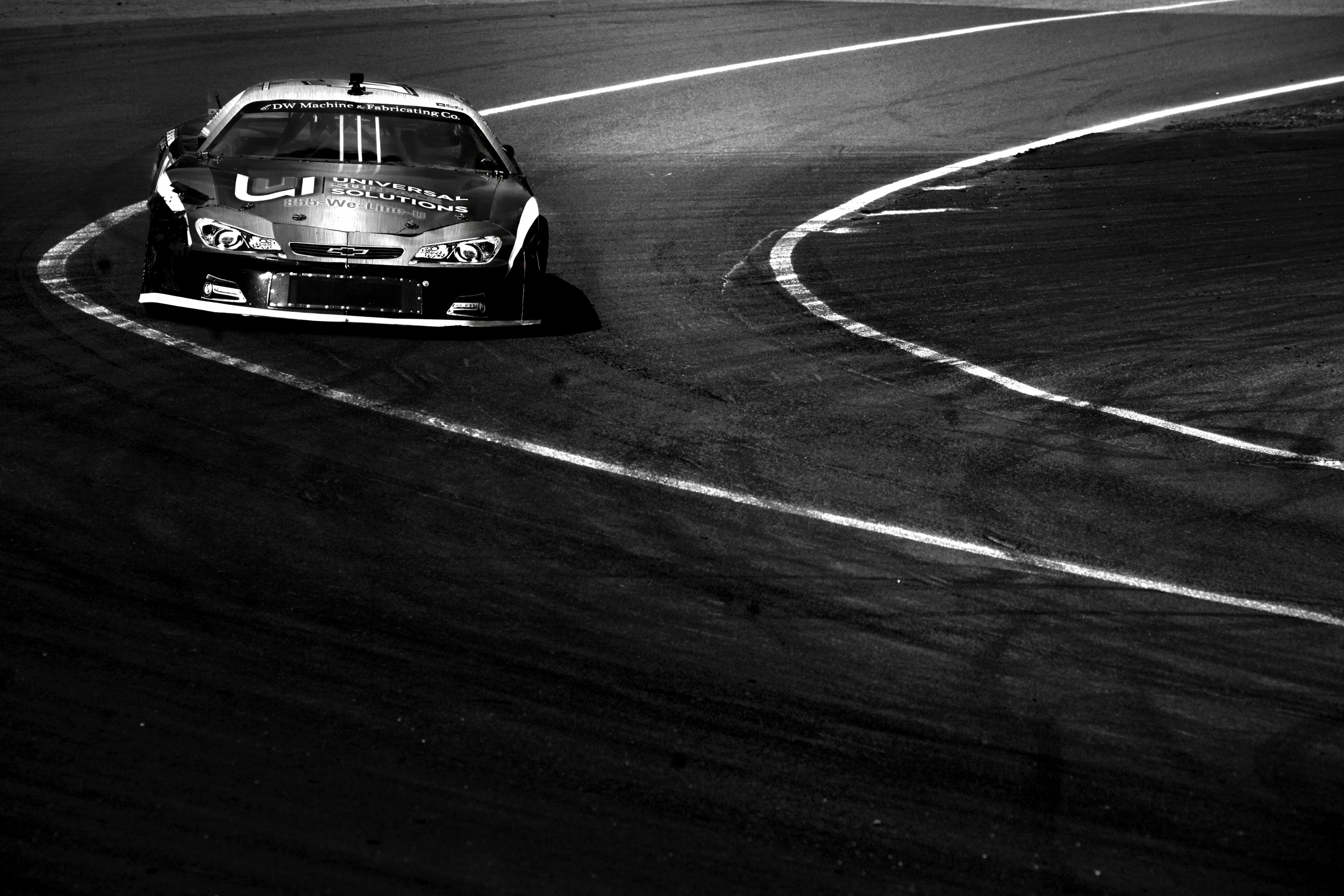
As for hobbies, I love the outdoors, so when the weather is nice, I'll be outside gardening, landscaping, swimming, hiking, building campfires or shooting motorsports photography at Evergreen Raceway. It's a 1/3-mile asphalt short track in Drums, Pennsylvania, which I used to frequent as a child. I was serendipitously granted the opportunity to freelance there last year, which has been a dream come true. I always feel like a kid again when I'm there.
‘Hurry up and Wait’
How and when did you start your journey in photography?
Although I didn't technically pursue professional photography until about 13 years ago, I've pretty much had a camera in hand for most of my life. Throughout the years, I was always the one snapping photos on field trips, at camp, at parties, of sunsets, of my pets, and of plants growing in the garden. I wanted to document visually everything I found interesting. My parents bought me a Fuji FinePix point-and-shoot camera when I was six, but even back then, I was obsessed with taking the best photos possible, and I knew that little camera wouldn't suffice. So, to cultivate my passion further, my father let me practise with his Minolta X-700, which is quite frankly a phenomenal SLR. I fell in love with the colour and bokeh of those vintage Minolta lenses, and there was no turning back. That camera hugely influenced my decision to start out with Sony's A Mount system when I switched to digital permanently, because of its compatibility with all Minolta AF lenses.
‘Cherry snacks’
For many of us, photography is either a hobby or a way of life. So, how would you describe your relationship with photography?
I have always considered myself an artist before a photographer. To me, photography is simply an extension of my passion for creation. Creating is my life. If I'm not creating, I feel like a part of me is starving.
‘On Top of the World’
‘Pondering the Little Things’
Which experience has influenced your approach to photography the most so far?
Definitely my kids! They're the reason I switched from drawing to photography in the first place. Once I had a newborn, it was virtually impossible for me, a sleep-deprived first-time mum, to find the energy and focus to continue sketching with charcoal and watercolour crayons when I was constantly interrupted. However, I accepted it as a new phase of life, and the pride I took in being a mother eradicated any desire to dwell on the transition. It was just another chapter, a new phase of life, and I loved it. Naturally, like any doting parent, I became obsessed with taking pictures of my children, trying to capture their candidness in a way that not only reflected the moment, but also how it felt. I wanted to relive those moments. I wanted everyone who looked at them to feel the same way.
‘Zen’
Describe your vision for your photography.
Unless I'm working on a specific conceptual idea or posed portrait, I wouldn't say that I have a particular vision; rather, I consistently have the same goal: whatever I create, I want it to move you.
‘My Solace’
The mood and compositions in your children portraits are outstanding! What is your secret and why are you so drawn by this photography type?
Regardless of the subject matter, I'm always observing my surroundings, looking for ways to capture moments bathed in light that make them seem magical. I'm drawn to child photography because their innocence, unlimited curiosity and sincerity move and affect the viewer in ways that nothing else can. I'm also drawn to children's raw, simple candour and how relatable their experiences are, to the extent that many adults can vicariously relive some of their favourite childhood memories through them. Another issue that has always resonated with me is the importance of children being able to be children — climbing trees, exploring the outdoors, swinging, observing nature, playing sports, getting dirty, and simply having fun. In this oversaturated digital era, where our youth are becoming increasingly addicted to screens every day, I am continually reminded of the importance of reminding people that this lifestyle robs children of the essence of childhood. Let them be kids.
‘Solitude’
‘Free as the Wind’
In your opinion, what are the main features of a successful children's portrait photographer?
To be a successful child portrait photographer, it's extremely helpful to be flexible, adaptable, and able to think outside the box. Children often refuse to pose in the way we want them to, and if we're trying to capture a candid moment, it's usually gone by the time we're ready to take the photo. You just have to accept this as an unavoidable possibility and be willing to work around it. Being creative on the spot and having patience are therefore important. I've lost count of the number of times I've gone into a shoot with a clear vision, whether candid or staged, only for something to throw my plans into disarray. This forced me to improvise, but by being prepared for this scenario, everything turned out all right in the end. Train yourself to observe. Watch people. Pay attention to how light hits everything around you. You can learn so much by watching and observing. You'd be surprised how magical a simple moment can be when framed in entrancing light or with emotive editing. For this reason, I believe that editing in a way that conveys emotion is pivotal when photographing anyone, but especially children, as this is what sets your work apart in an industry saturated with this particular genre.
‘Someone to Watch Over Me’
Could you tell us more about your workflow, from initial idea to final product?
In my experience, it's crucial to get as much right in camera as possible when it comes to any form of photography. This makes the editing process much easier because you're just building on and enhancing what's already there, rather than spending time fixing technical errors or discrepancies. I've always edited everything manually in GIMP, mostly working with layers, masks, curves, levels, brushes, and exposure adjustments. I'm well aware that this method is much more tedious and time-consuming than batch editing with an action or preset, but to me, photography is a form of digital painting, and manually making all the adjustments guarantees the uniqueness and authenticity that makes each image stand out. In an era where artificial intelligence is taking over everything, including this field, I believe this style of editing is important if you want your work to stand out from the crowd — machine or not.
‘Magic and Wonder’
‘Best Seat in the House’
Where do you find inspiration for the visual stories you want to tell? What inspires you?
I don't usually have a preconceived idea unless I want to set up an abstract concept or artistic posed shoot, which is usually inspired by a song, a poem, a Bible verse, or a specific mood or atmosphere. I always follow the light, too. Depth and contrast are important in a captivating photograph. After all, a shadow only appears dark because of the light. As for subject matter, I've never limited myself to one specific genre. I've photographed everything from people and architecture to still lifes and abstracts. The hunger of an artist to create is not only satisfied by the act of creation, but also by the inspiration that gives us the initial nudge to create. The search for inspiration is never-ending.
‘Revere’
Many people believe that gear is not very important when you are passionate about photography. However, could you please tell us what equipment you use, such as your camera, lenses, lighting and tripod?
I completely agree that gear is not the most important factor when it comes to creating captivating work. I was shortlisted in the Sony World Photography Awards in 2015 with a five-year-old second-hand Sony α700 paired with vintage Minolta lenses — far from top of the line! Even now, I use cameras that are considered outdated by industry standards: two Sony A900s and an A99II. The sentiment 'they don't make them like they used to' definitely rings true with these legends, especially the A900 — it's built like a tank! If it didn't perform so poorly in low light, I would never have bought the a99ii. Sure, I could probably benefit from faster autofocus and better low-light capabilities, but what these full-frame cameras offer is sufficient for my current needs, and they get the job done, so I'm happy with them.
My go-to lenses are vintage Minolta AF, as I mentioned earlier: the 28–70 f/2.8, 35 f/2, 85 f/1.4, and 80–200 f/2.8. You just can't achieve bokeh and colour like that with newer lenses.
‘Exhuberance’
‘Little Mama of the Wild Olives’
When I have time to think more creatively and outside the box, I use my Lensbaby optics. I have the Velvet 85, Twist 60, Sweet 50, Edge 50, Sol 45 and Burnside 35, as well as their macro attachments. Each one produces a unique effect, such as focal zoom, soft ethereal edges, dramatic vignetting and swirled, Helios-like bokeh. There's nothing better than creating an artistic shot in-camera with no post-processing alterations. Lastly, for those times when I need to use a flash, I upgraded to a Profoto A1 this past winter. Although I haven't had much of an opportunity to use it yet, I can already tell that it's going to be incredibly useful. The 3–5 second recycle time on my old flash was brutal. Having said that, yes, there will come a time when you outgrow your gear as you advance in your field. However, make sure you maximise its use in your area of expertise before feeling the need to upgrade. Shopping for new camera gear can be overwhelming, but narrowing down your search to a specific need will make it much easier.
‘A Beautiful Catastrophe’
‘Les Miserables’
Which photo is your favourite? Please tell us the story behind your choice.
One of my favourite photos is probably a candid black-and-white shot called 'Gotcha!'.
It's a picture of my son, who was 6 at the time, getting completely soaked with the hose by his father during an epic water battle in our backyard on a sweltering summer's day in the high desert of Southern California. The look of gleeful defeat on his face is priceless, and his smile is contagious. It's a perfect childhood memory of a summer's day. I remember it like it was yesterday — my useless lens hood kept falling off, hence the harsh lens flare at the top of the image. Funny enough, this ended up sparking debates online, with some people insisting that it was shot with an off-camera flash instead of backlit sunlight. I read the comments with mild amusement, as strangers argued about how I took a photo that was about as unplanned as they come!
‘Gotcha!’
Which photographers or mentors have influenced you and your photography, and who are your favourites?
The first person to inspire me was Hengki Koentjoro, with his velvety, rich, moody black-and-white photographs. They are absolutely mesmerising. I also love Marius Vieth's street photography — he transforms ordinary urban scenes into pure works of art. I stumbled across his work on Flickr around twelve years ago and have loved it ever since. Both artists create pieces that take evocative minimalism to a whole new level, and they are a real treat for the eyes.
Now that we're almost at the end of the interview, could you please tell us about any photographic projects you'd like to be involved in?
Funny you should ask, Yvette, because, as you know, this interview is over two years old. To be honest, I had to put my photography on hold seven years ago when I was at my worst with Lyme disease. I couldn't keep up with social media, only took on two or three clients a year and, even then, I barely had the ability to function outside the home because of the debilitating pain and fatigue. My husband had to handle almost everything alone while I tried to keep my head above water. I had to focus all my physical and mental energy on taking care of my family. But then, this past summer, something changed and the Lyme disease unexpectedly went into remission. I finally had the energy to start shooting and editing regularly again. I know that my abilities are a gift and I don't take them for granted. I am so humbled and thankful to God for enabling me to return to one of my favourite pastimes and do what I love. Not to mention the fact that crossing over to motorsports photography at one of my favourite racetracks is just surreal and some of the most fun I've ever had in this industry. When I'm there, it feels like time stops — all the world's instability just disappears, consumed by the lights, sounds and smells. I'm just lost in the moment, and the energy is contagious. It might sound out of place to throw a fine artist into the middle of an asphalt short track, but blending the two at a venue as untamed, competitive and unpredictable as grassroots racing hugely inspires me and pushes my creativity in ways I would not otherwise have encountered. Every day at Evergreen, I see it as a blank canvas — I never know what I'm going to come home with. That challenge, paired with the relationships I've developed with my colleagues, is what drives me. That, and my kids who tag along, of course :)
‘Friends’
‘Game Face’
‘Curves’
Is there anything else you would like to add, and what are your thoughts on using 1X as a home base for your work?
One of the things I love about using 1x as a fine art photography platform is its consistency: consistent quality of content, consistent standards and consistent layout. Unlike many photography websites, 1x doesn't implement annoying, unwelcome changes and unnecessary "upgrades" over time that make using them confusing or less interesting because they deviate from their original purpose of sharing high-quality imagery. I have a huge appreciation for the variety of artwork exhibited on 1x and for the fact that its users span the entire world. There's no sense of competition on this platform, only mutual appreciation for the beautiful work and the artists behind it.
‘Encore’
Thank you, Christine. As the title of your last photo says, 'Encore'. I truly hope to see 'More' of your outstanding work.
|
 | Nancy Lee PRO such inspirational and fun images! I enjoy them very much! |
 | yein PRO |
 | Adrian Donoghue PRO Beautiful work, thanks for sharing |
| | yein PRO Your thoughts on the kids
The action is so touching.
I enjoyed the great work. |
| | Eiji Yamamoto PRO Dear Christine and dear Yvette, thank you so much for this interesting interview with great photography! I'm very inspired! |
 | Grethe Stene PRO Powerfull, Great light ! |
 | Yvette Depaepe CREW Christine, you're such an inspiration to me ... Thank you so much for this interview ♥ |
| | Angelika Vogel PRO This Portfolio of children is sooo expressive and sweet and powerful and children's curiosity and amazement so impressive...and and and... Congratulations, dear Christine, and thank you very much, Yvette, for this excellent portfolio! |
| Yvette Depaepe CREW Thank you, Angelika ... I admire Christine's work and her beautiful strong personality ;-) |
| | Steven T CREW Thank you, Christine and Yvette. Wonderful photos. "Free as the Wind" is beautiful and timeless. |
| Yvette Depaepe CREW Free as the wind also is one of my favorites, but Christine's work is sublime ;-) |
 | Marion Keijzer PRO Ontroerend schoon, verhaal, foto's, om stil van te worden. In schril contrast met de bommen die vallen, de oorlog de honger de misbruik van kinderen en zoal niet meer. Ik ben woorden loos, stil en ook wel een beetje verdrietig. |
| Yvette Depaepe CREW Beautiful comment, Marion ... and worth to translate: Moving beautiful story and the photos are enough to leave you speechless. This is in stark contrast to the falling bombs, war, hunger and abuse of children. I am left speechless and feeling a little sad. |
 | These B/W images are so powerful! |
| | Jane Lyons CREW Christine, your work is exquisite, as are your children. So glad that you've recovered and are back behind the camera. Thank you and Yvette ! |
| Yvette Depaepe CREW Thank you Jane ... |
by Editor Jane Lyons
Edited and published by Yvette Depaepe, the 27th of March 2026
“somewhere in Italy”
As we all know, art is subjective.
If ten people were asked to select their twenty favourite photographs from Holger Droste’s portfolio, the results would undoubtedly be very different. Yet within that diversity of opinion lies something undeniable: Holger’s work is instantly recognizable.
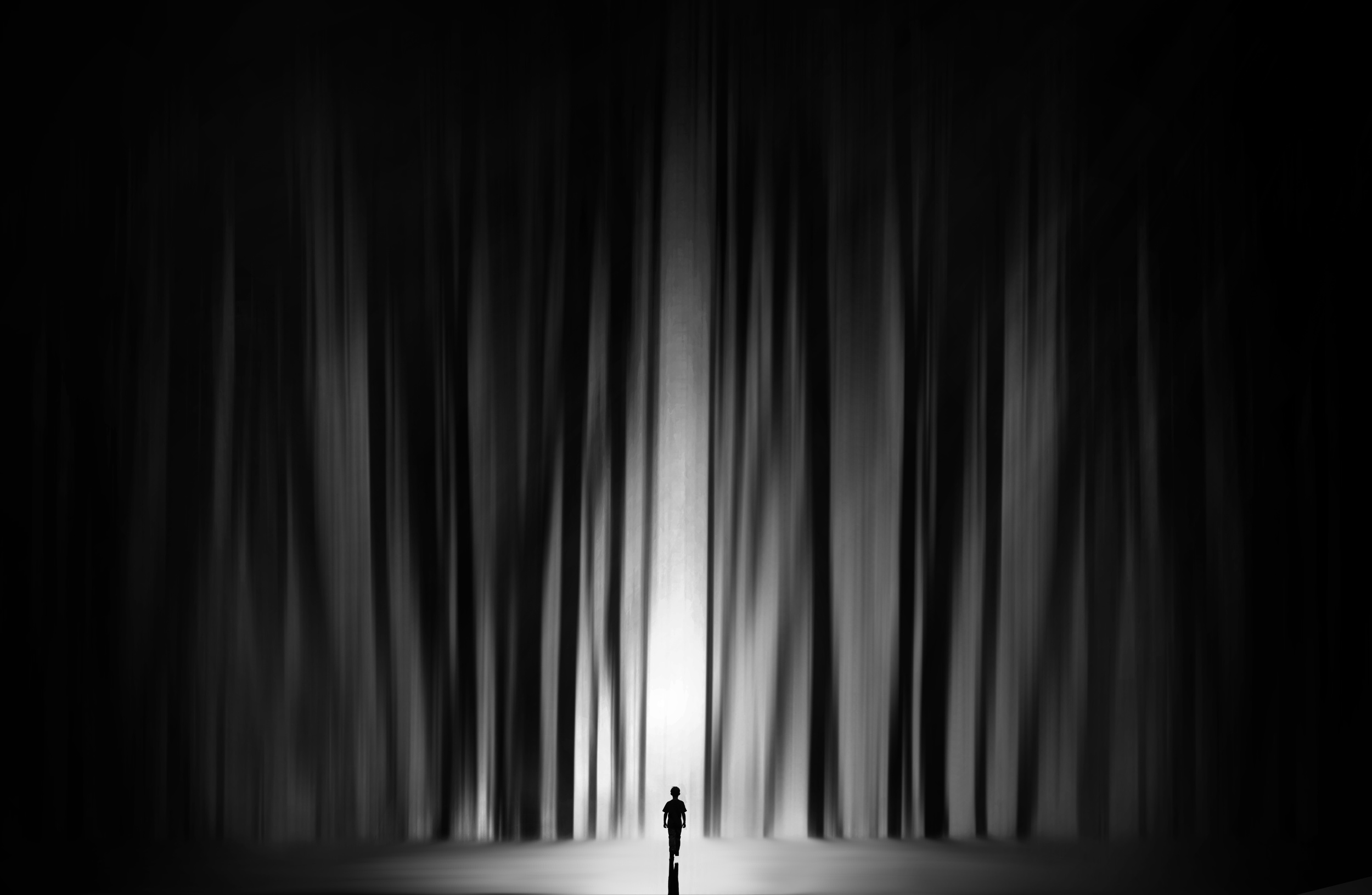
In an age when billions of images circulate online every day, developing a distinctive photographic style is no mean feat. Holger has achieved precisely that. His distinctive black-and-white conversions — severe, dramatic and unapologetically vintage — are his signature. The tonal range is bold and uncompromising. Deep shadows swallow detail, while highlights cut sharply through the darkness. The result often resembles stills from film noir from the 1930s and 1940s — images that feel lifted from another era, suspended somewhere between memory and cinema.
“Rainy Days”
“the way to me”
“Laggo Maggiore”
“Woman of Aquarius”
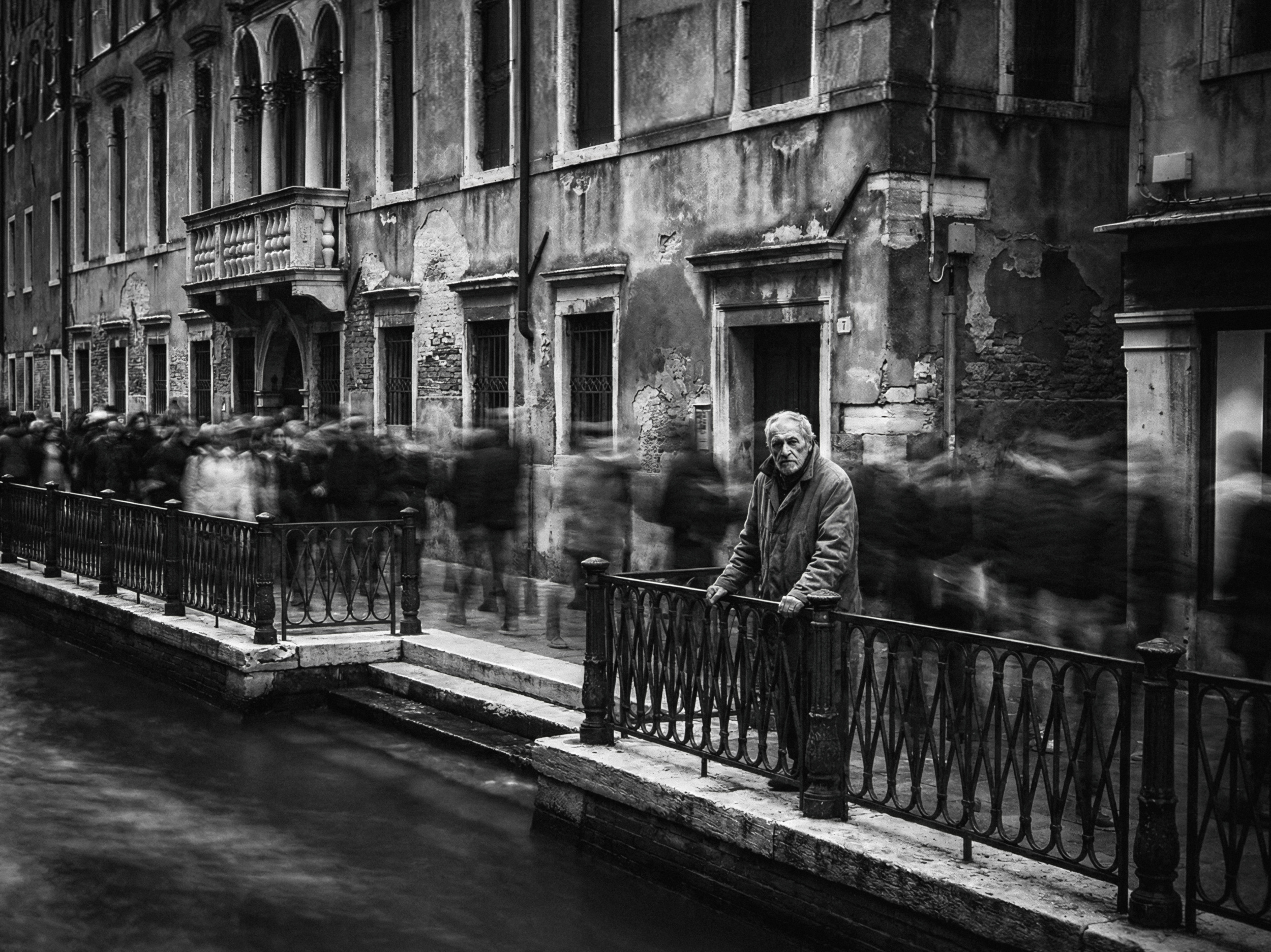
“Venedig V”
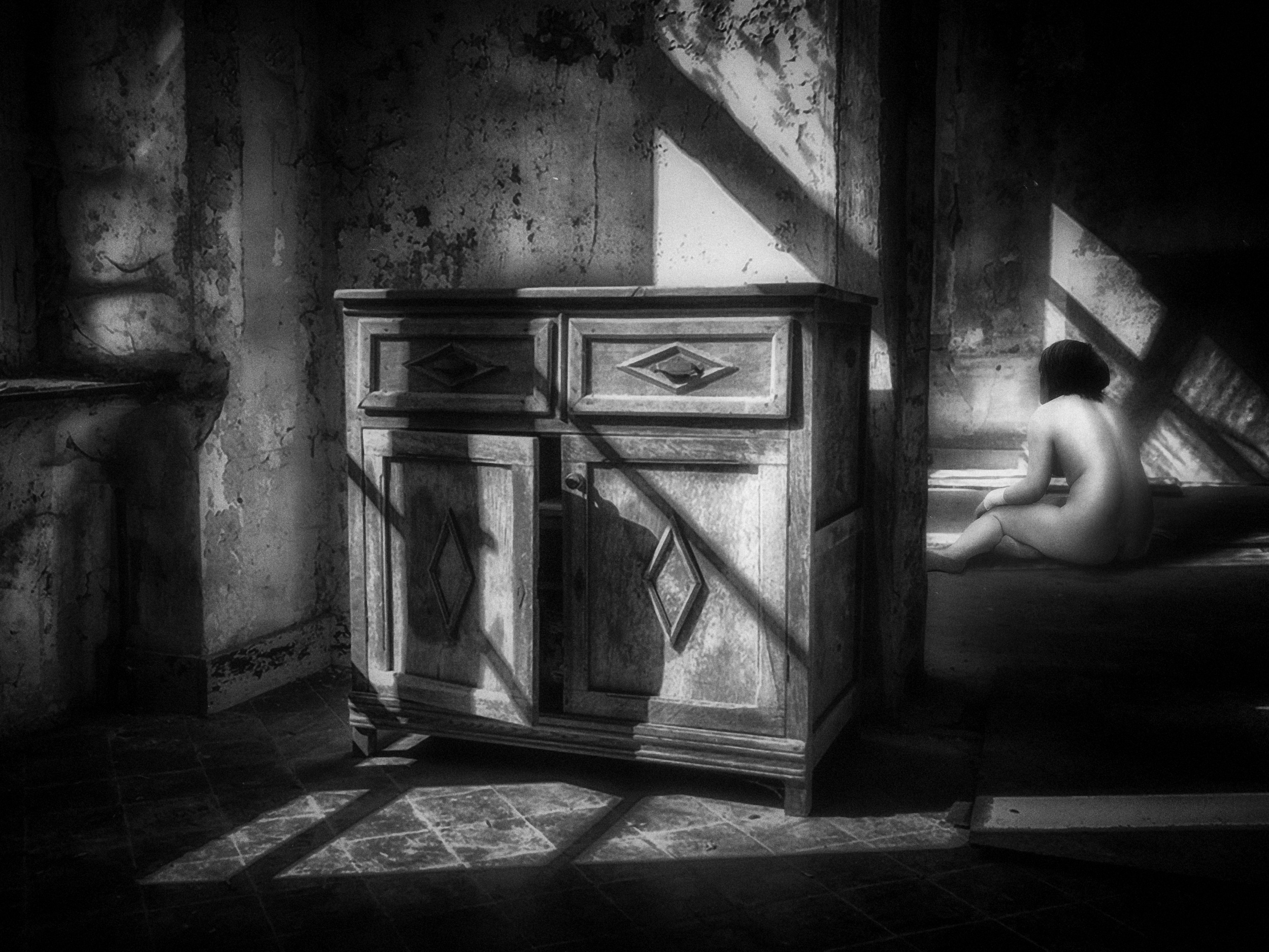
“the dresser”
“the chimney sweeper”
There is a sense of gravity to his monochrome work. It is more than just black and white; it is atmospheric, brooding and emotionally charged. His photographs feel aged in spirit, not in deterioration. They carry the weight of history.
Holger himself speaks of an emotional connection to the past. Drawing inspiration from the black-and-white film classics of the 1940s and 1950s — Humphrey Bogart, Orson Welles and Peter Lorre, for example — as well as the stark realism of Italian neorealism from directors such as Roberto Rossellini and Vittorio De Sica, he draws from cinema's most expressive period. This influence is evident in his tendency towards dark, moody imagery with a distinct narrative. When he does use colour, it is restrained and vintage inspired.
“Forest-the other Side-”
“Stille Tage”
“Souls of City”
“railway station”
“italienische Impressionen”
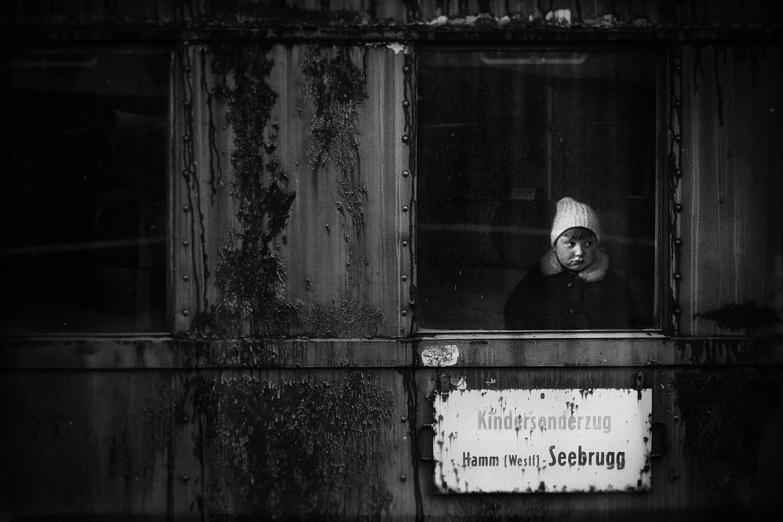
“Kindersonderzug”
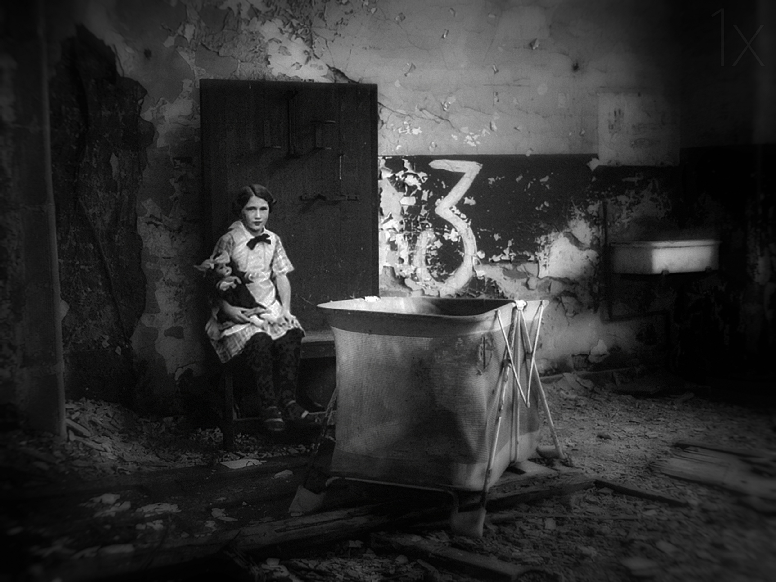
“3”
“Canape”
He often uses double exposure techniques to layer elements and introduce mystery and psychological depth. Real objects form the basis of his work, but subtle manipulations transform them. He describes his style as 'surreal realism': he photographs reality and then enhances it with subtle details that create a quiet surreal effect. The result is work that feels both grounded and dreamlike.
While his portfolio is diverse, it is curiosity that drives his experimentation. Yet, no matter the subject, his core aesthetic persists. For Holger, technical perfection is secondary. Harmony is important when architecture is present, but above all, an image must have mood, history, expression and soul.
He doesn't just photograph scenes; he resurrects atmospheres. His work feels like memory made visible — fragments of a cinematic past reimagined through a modern lens.
“Emilia Romagna II
“Sicily”
“the Highlands”
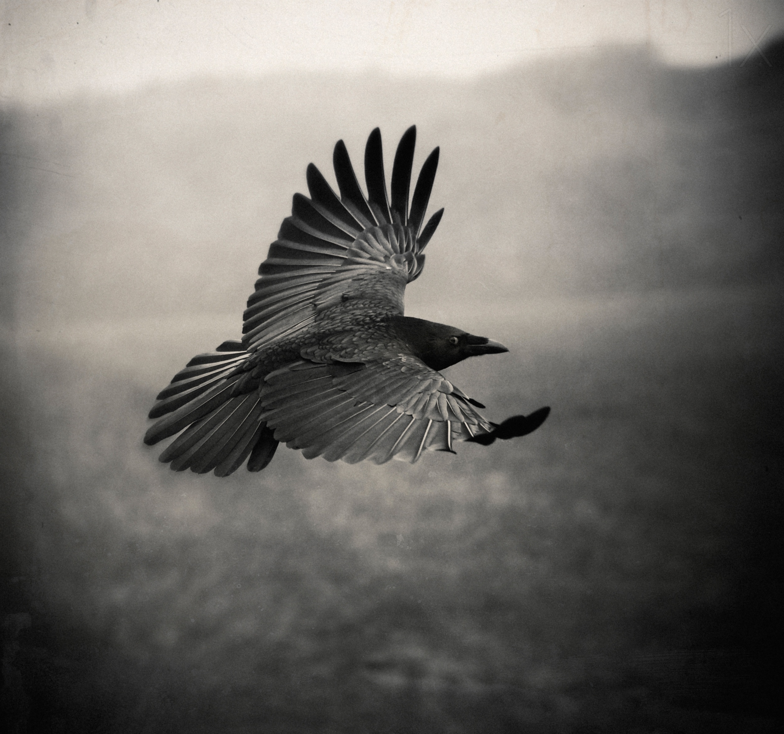
“the Crow”
Holger, it was wonderful selecting favourites from your impressive portfolio. Thank you for being part of the 1x community!
|
 | txules PRO Fascinating corpus of work |
 | Incredible images!!! Thank you for the article! |
| | Yaping Zhang PRO 祝贺获奖大师!令人赞不绝口的作品。视觉独特!精彩纷呈的杰出艺术作品!感谢亲爱的简和伊薇特为我们带来了视觉享受及有趣精湛的文章! |
 | Mesut Yalcin PRO very good
|
| | Miro Susta CREW Excellent photos from master photographer, accept my congratulations Holger. Many thanks for creating and publishing this interesting article dear Jane and Yvette. |
 | Du bist einer von denen hier zu dem ich erfurchtsvoll aufblicke. Großartige Zusammenstellung Deiner Meisterstücke.
Thanks a lot also for her work to Jane |
 | joanaduenas PRO An extraordinary selection of works by this impressive monochromatic photographer, thank you for showing them to us. |
 | Kathryn King PRO Absolutely stunning work, a pleasure to view and ponder. |
 | X-FlyingKN PRO Holger’s work is truly distinctive — powerful, cinematic, and full of soul !
Many thanks to Jane and Yvette for bringing such inspiring artistry to us :-) |
 | An incredible series of diverse images. Inspiring work! |
 | I am deeply moved by the art of Holger Droste. I follow his work since I joined 1X. All his work, whatever the subject, is high class. |
 | Gila Koller PRO Amazing B&W images Holger!! Congratulations! |
 | Elizabeth Allen CREW Superb, inspiring work, congratulations, Holger! Thanks to Jane and Yvette. |
 | Heike Willers PRO Thank you so much for showing us this wonderful collection of artwork! Impressive work, dear Holger! |
 | I'm thrilled! What first-class photographic work! |
 | Sandro Sardoz PRO Masterpieces... !!! |
 | Gil Beer PRO Wonderful. Strong images |
| | Eiji Yamamoto PRO Thank you so much for this wonderful article with great photos!
Dear Holger, congratulations! It's so beautiful, poetic and emotional. Dear Jane and dear Yvette, as always, thank you so much! It's very inspiring! |
| | Yvette Depaepe CREW I admire your work for a long time, Holger. You're such a talented photographer. I hope to see your work here for many more years. Cheers, Yvette |
 | Absolutely superb images. Congratulations! |
| | Angelika Vogel PRO Holger, herzlichen Glückwunsch zu diesem außergewöhnlichen, beeindruckenden Portfolio! Ja... was Franz sagt... Große Photokunst". |
 | FranzStaab PRO Große Fotokunst! Sehr gut! |
by Yvette Depaepe
Published the 26th of March 2026
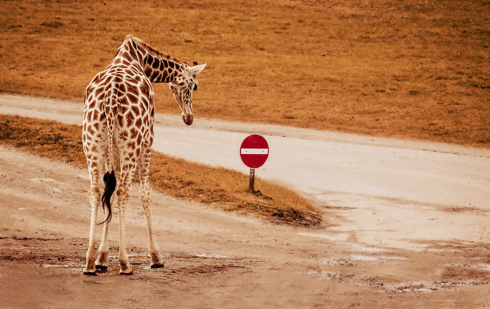
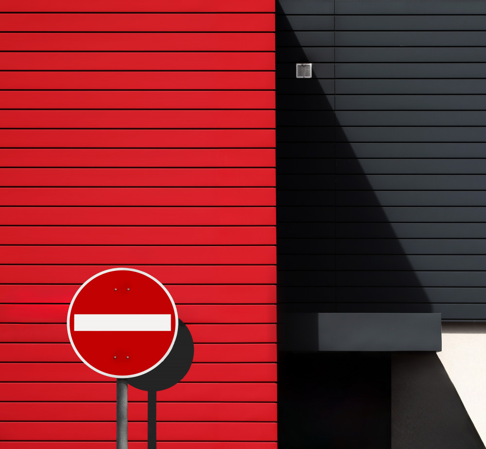
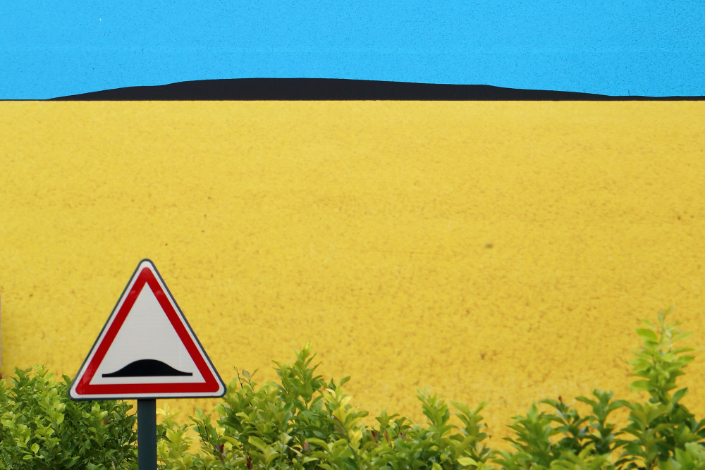
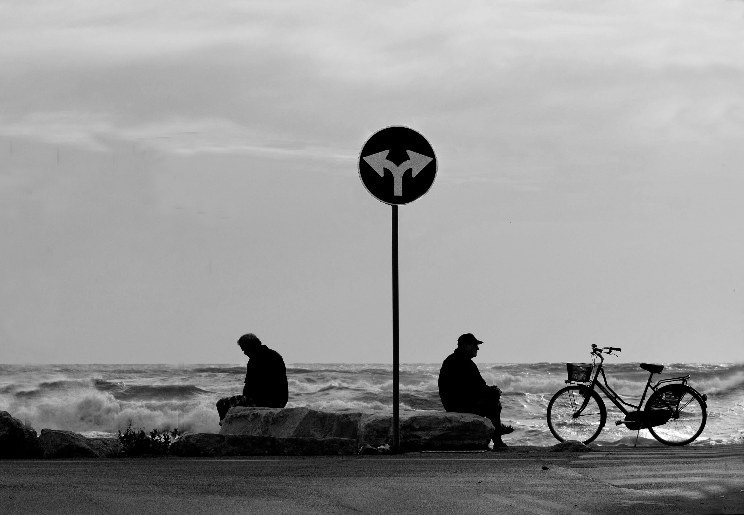
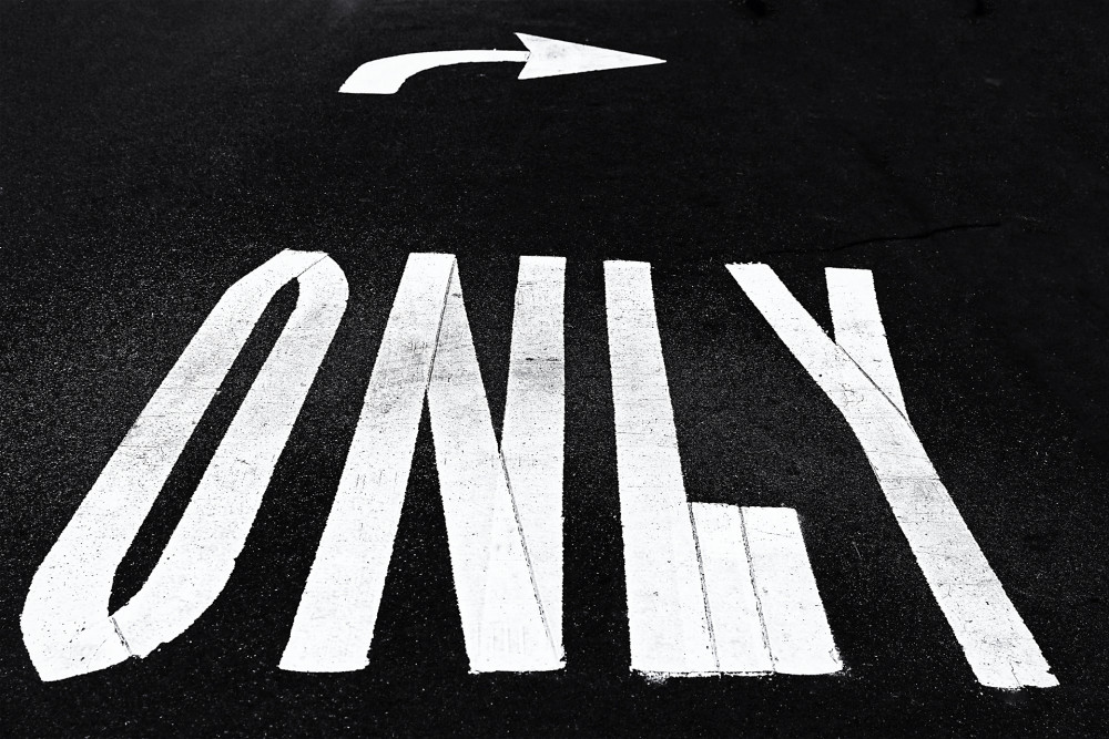
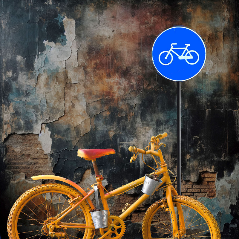
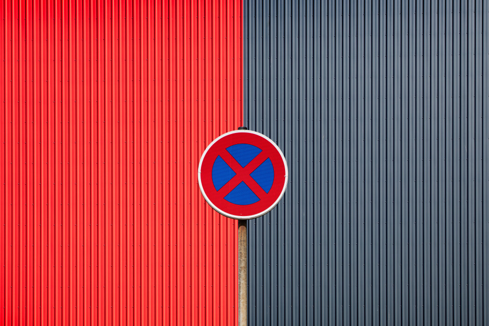
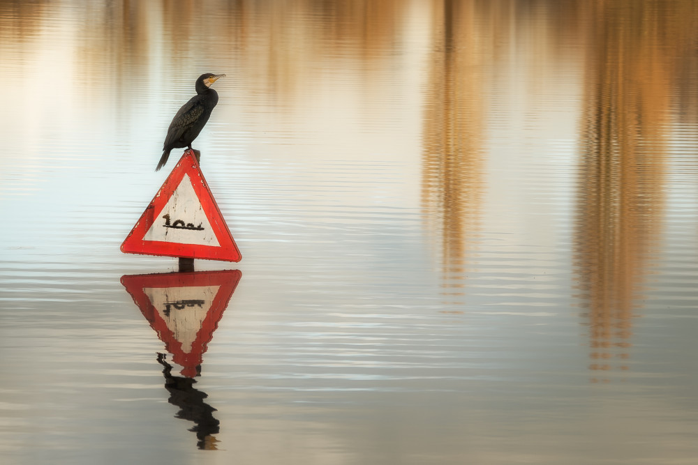
'Signs as objects of Art'
Signs can function as a form of direct communication or as a symbolic language. Designed to instruct or regulate, they often reveal much more when removed from their context by a photographic lens. The resulting text and imagery can then become expressive, ironic or poetic. Excellent images of great visual interest were submitted.
The winners with the most votes are:
1st place : Uschi Hermann
2nd place: Adolfo Urrutia
3rd place : Giorgio Toniolo
Congratulations to the winners and honourable mentions.
Thanks to all the participants in the contest 'Signs as objects of Art'umbers as Art Objects'
The currently running theme is 'Spring is in the air'
Spring is a fantastic time for nearly every type of photography. There are so many amazing subjects and opportunities: outdoor portraits, macro shots of blooming flowers and budding trees, spring landscapes, and baby animals, to name just a few.
This contest will end on Tuesday the 7th of April 2026 in the afternoon.
The sooner you upload your submission the more chance you have to gather the most votes.
If you haven't uploaded your photo yet, click here.
1st place: by Uschi Hermann
 2nd place: by Adolfo Urrutia
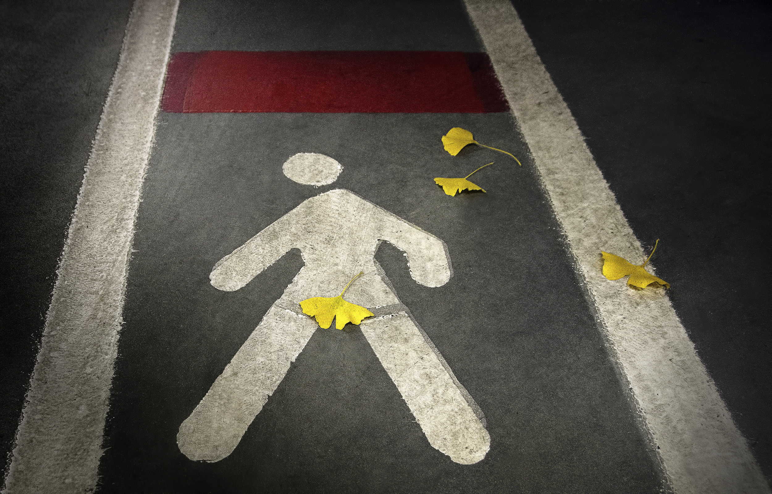 3rd place: by Giorgio Toniolo
HONOURABLE MENTIONS
by Hans-Wolfgang Hawerkamp
by Vincent DUMOULIN
by Luciano Caturegli
by Martin Fleckenstein
by Raffaele Corte
by Matthias Polakowski
by Piet Haaksma
You can see the names of the TOP 50 here.
|
| | Yaping Zhang PRO 祝贺所有参赛获奖老师!参赛作品视觉独特!精彩纷呈! |
 | This is such a wonderful collection of impacting images! Congratulations to all the featured photographers. 👏👏 |
 | Lucie Gagnon CREW Congrats to the winners! There were some very fun entries! |
| | Kathryn King PRO All such interesting images, congratulations!! |
 | Roland Weber PRO As for me, it was a very unique and interesting context. My best congratulations to all winners. |
| | congratulations to the winners |
by Yvette Depaepe
Published the 24th of March 2026
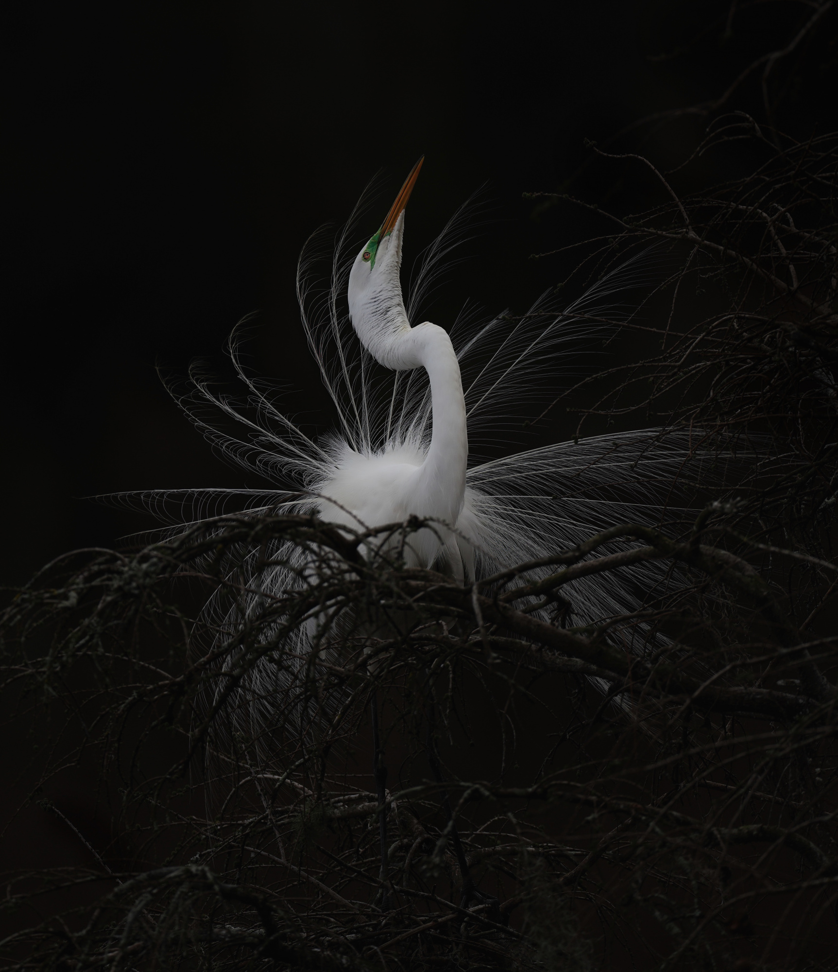
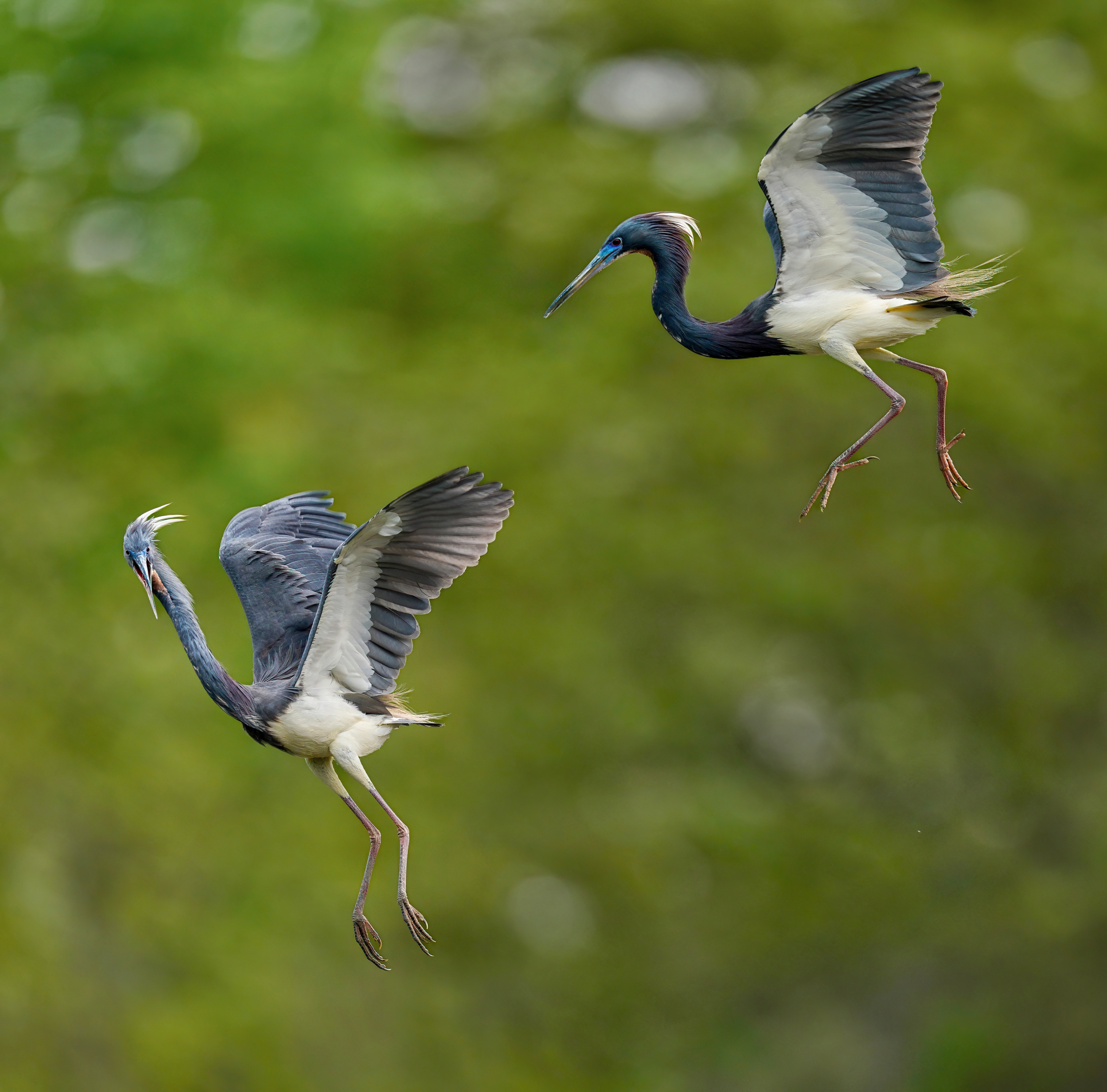
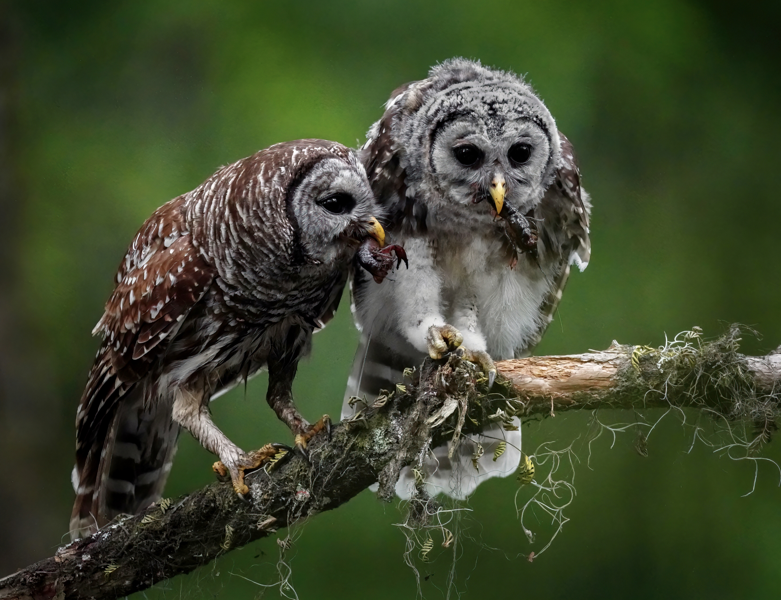
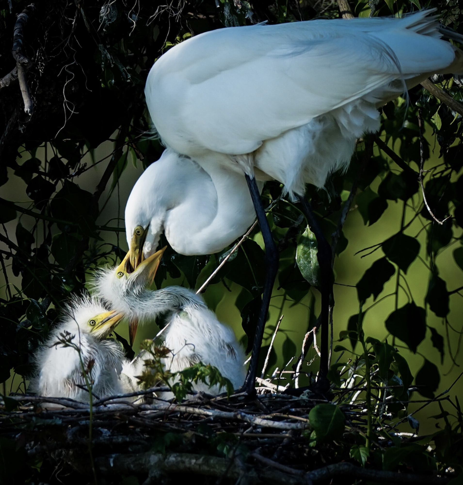
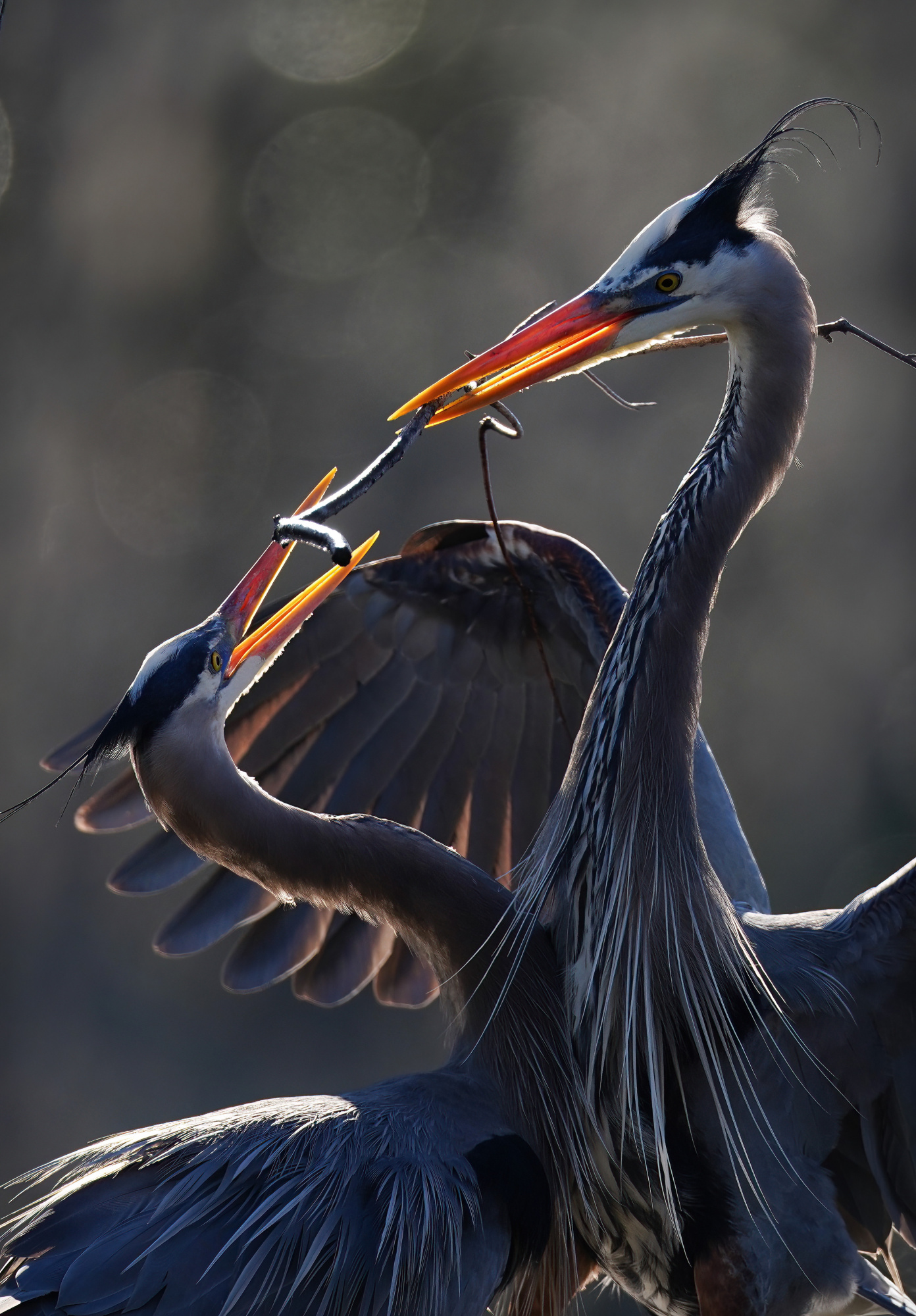
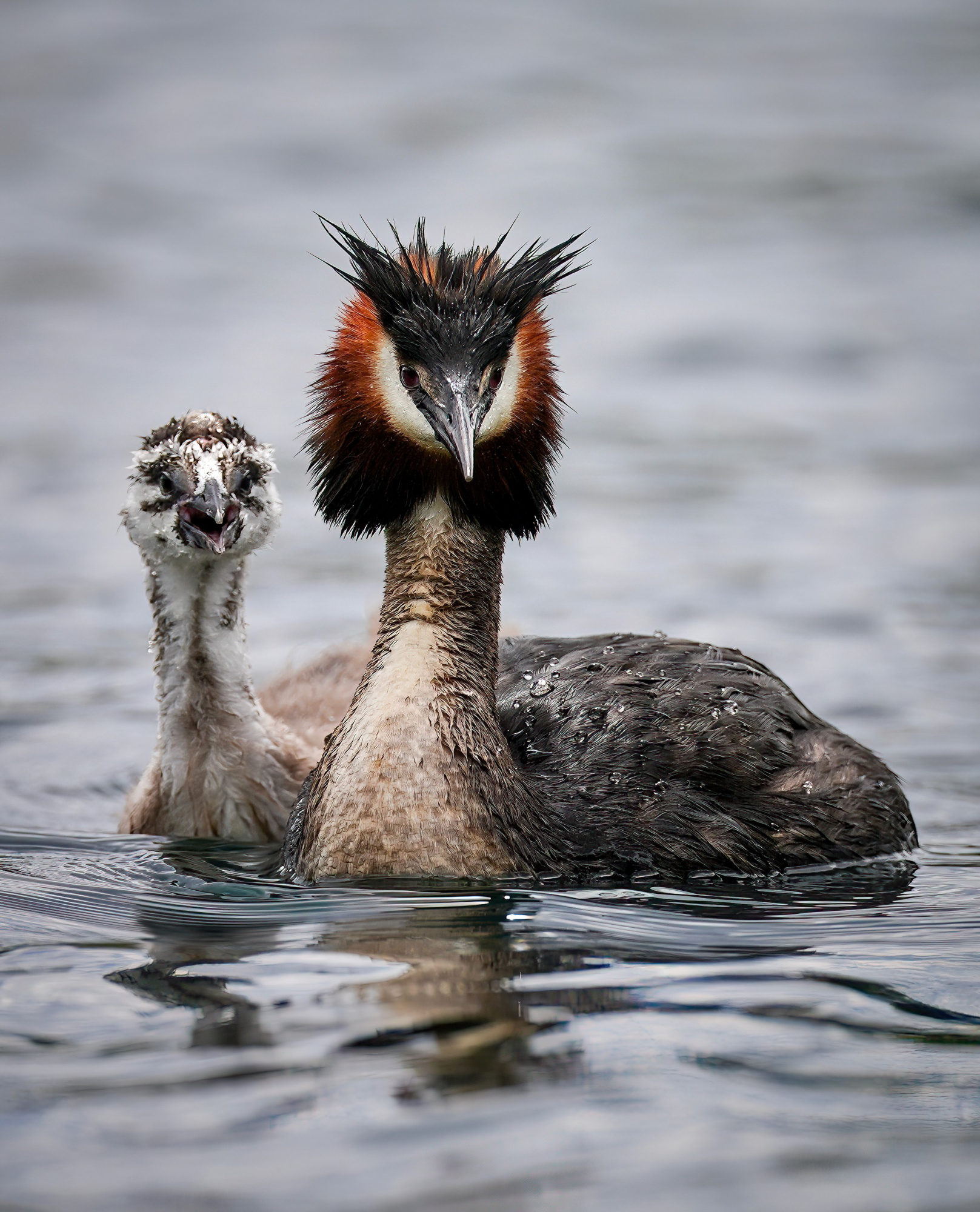
Cami Marculescu aims to encourage people to see wildlife and nature in a new light. She wants people to see with eyes of wonder and compassion, so that they realize deep down that we are all the same: humans, animals and birds. Her noble purpose is to encourage people to think twice before endangering species. To preserve what we have for future generations. Enjoy her beautiful work and find out more about this talented nature photographer.
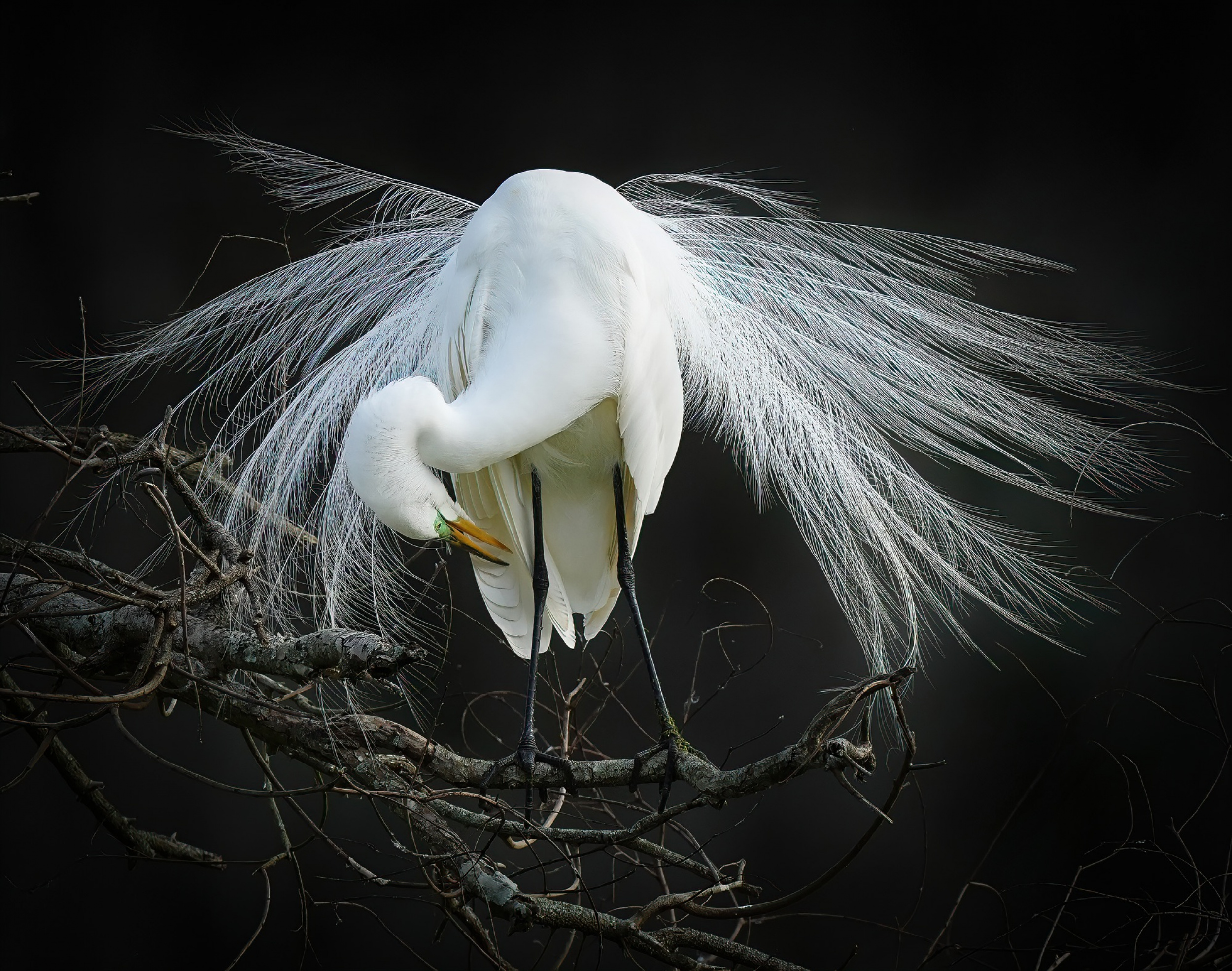
‘Elegance’
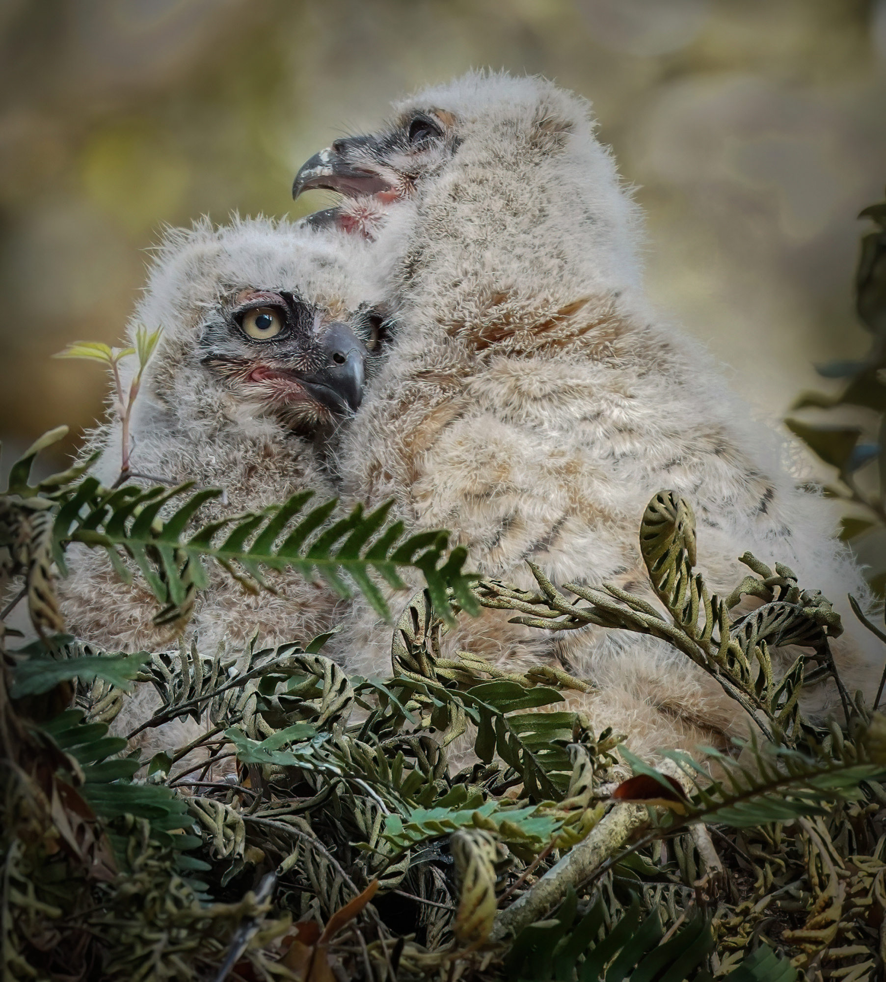
 'My babies'
Dear Cami, when and how did you start your journey in photography?
I began my photographic journey in 2017 by taking the iPhone Photo Academy course. As a lifelong nature and wildlife enthusiast, I was captivated by what I learned on the course, from basic composition rules to ways of conveying a powerful story to the viewer. I was determined to take better pictures of our magical nature and wildlife.
However, I soon realized that iPhones have limitations, no matter how good the photographer's eye is. Soon after, I bought my first camera and 300 mm lens and began my journey as a wildlife photographer. I was fortunate to learn from the best: Tin Man Lee, whose wildlife photography course I took during the pandemic.
My passion for capturing bird behavior grew and grew, as I strove to convey a story and emotion to the viewer — just as I experienced it in the field.
‘Elegance in white’
For many of us photography is either a hobby or a way of life. How would you define your relationship with photography?
I am a busy physician. Photography is a hobby, a meditation in nature, and a way of seeing the world with different eyes. I find it fascinating.
Which experience has influenced your approach to photography the most so far?
There is one thing I will never forget: the first time I looked into an owlet’s eyes. The feeling I had then is difficult to put into words, but essentially it was this: we are one with nature, one with every living soul. Time stood still. I felt a deep appreciation for all living things. I felt lucky to be the soul able to experience something so powerful.
‘Brotherly love’
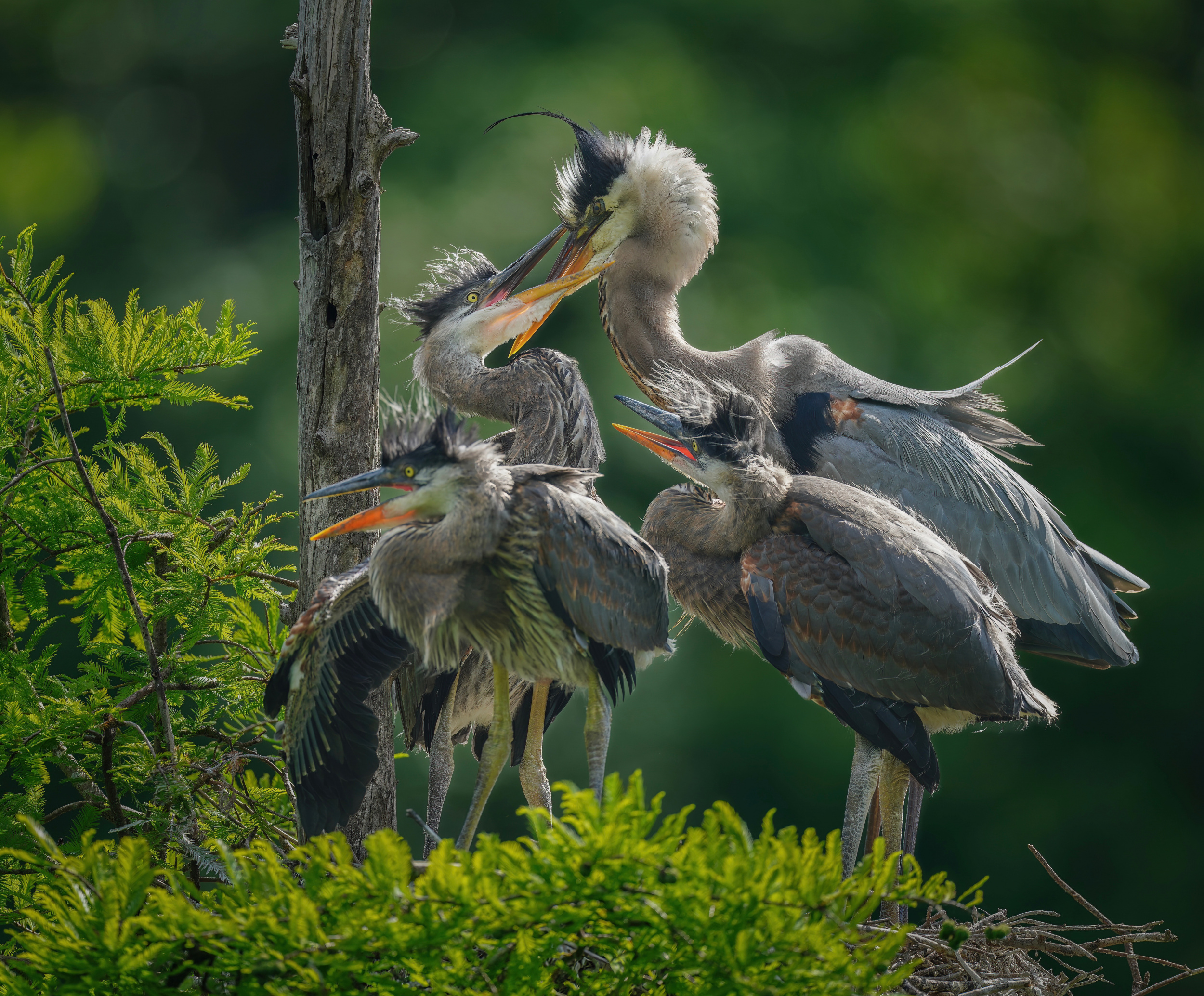
What draws you to wildlife photography, particularly bird photography?
I am fortunate to live in South Carolina, where I am surrounded by a great diversity of wildlife, particularly birds. There is a small pond near my house where I can see several species of birds. It was there that I took my photographs during the pandemic.
Then, of course, there's Magnolia Gardens and the Audubon Swamp in Charleston, which are amazing places for bird photography. I have had the opportunity to observe fascinating bird behavior, such as courtship, emotions, raising their young and interacting with each other.
‘The chase’
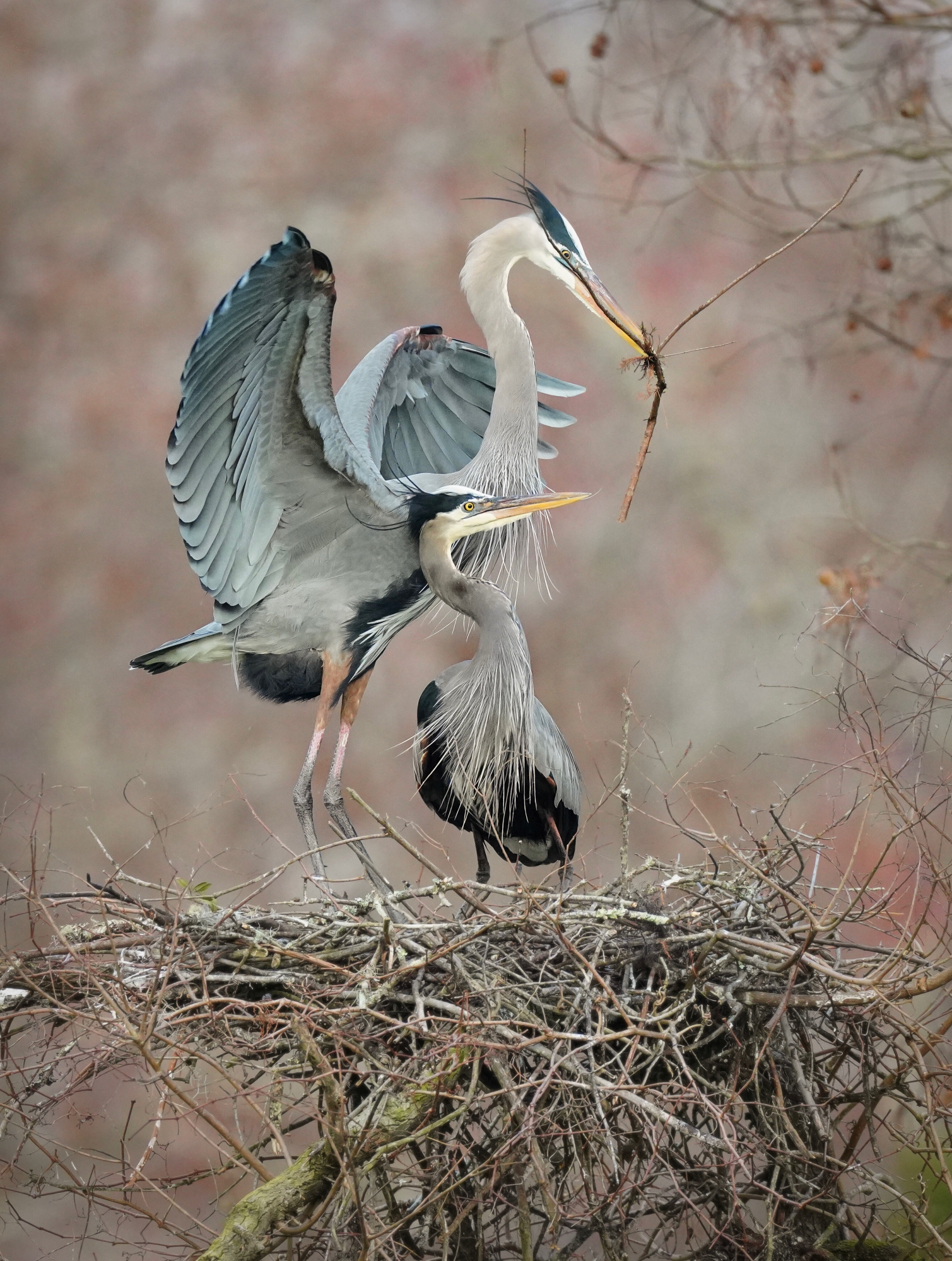
‘Building a home together’
‘Double snack’
‘A mother’s love’
Which is more important to you: the mood and story behind your images or technical perfection?
Although I always aim for sharpness and good composition, the most important thing for me is conveying emotion and a story to the viewer. I believe that wildlife has a soul, and I try to capture that essence in my work.
‘Intimate Moments'
‘Tag of love’
What is your relationship with your subject matter beyond simply observing it?
I have a deep connection with birds, especially owls. I respect all wildlife and practice ethical photography. As a child, I always helped injured animals, and I still do today.
Through my photography, which sometimes includes images of conservation efforts, I aim to raise awareness of the dangers that human behavior can pose to wildlife and endangered species. I also capture humorous moments that might make the viewer smile. Perhaps we recognize ourselves in them?
Do you prepare carefully the locations where you intend to photograph?
I have a few favorite places and I always consider the light, composition and background. I try to position myself at eye level. Occasionally, I travel abroad with my 600 mm lens. I have fond memories of taking photos at Lake Wanaka in New Zealand.
‘Australasian crested grebe with chick'
Describe your overall photographic vision.
To make people see wildlife and nature differently. With eyes of wonder. With compassion. To realize that, deep down, we are all the same: humans, animals and birds. To encourage people to pause before endangering species. To preserve what we have for future generations.
What characteristics do you think are essential for a wildlife photographer to be successful?
I believe it stems from a true love of nature and wildlife. I asked myself why I am so drawn to photographers such as Federico Veronesi, Andy Parkinson and Tin Man Lee. It's because, beyond their technique and eye for composition, their photography exudes passion and love for wildlife.
One can be technically perfect in every way and still lacks the ability to convey emotion. I will always strive to convey emotion and a story to the viewer. Wildlife photography also requires patience, as well as the ability to capture what you saw in your mind long before you got the shot, after taking lots of "failed" images.
Could you tell us more about your creative process, from initial idea to finished product?
It’s quite simple. I shoot in RAW and do some basic editing using the Lightroom Mobile app on my iPhone. I then transfer the image to the big screen of my laptop to carefully review and edit it for sharpness, composition and noise before publishing.
What is the source of your inspiration, and what is it that inspires you the most?
Everything around me. Beauty is everywhere. Some of my most highly awarded images were shot right in my backyard. I just need to pause and observe to truly be in the present moment.
‘Eye to eye’
Many people believe that gear is not very important when passion is strong. Could you please tell us what gear you use?
I use a Sony A7R IV and a Sony f 4 600 mm lens, which I have been using for several years. I do not use a tripod for wildlife photography, nor do I use flash or any artificial lighting.
What would be your favorite photo? Please tell us the story behind it.
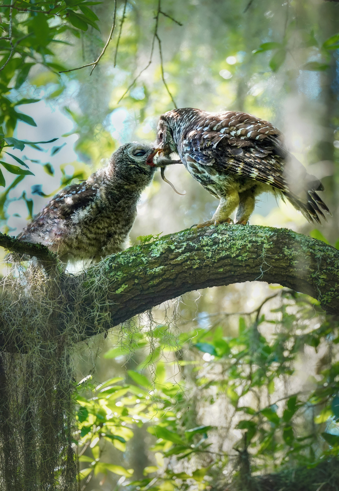
I have a few favourite images, but one that is more recent comes to mind. It shows a mother barred owl reaching out to her owlet with a crawfish. I was fortunate enough to witness the tenderness and care between them, which seemed almost cinematic.
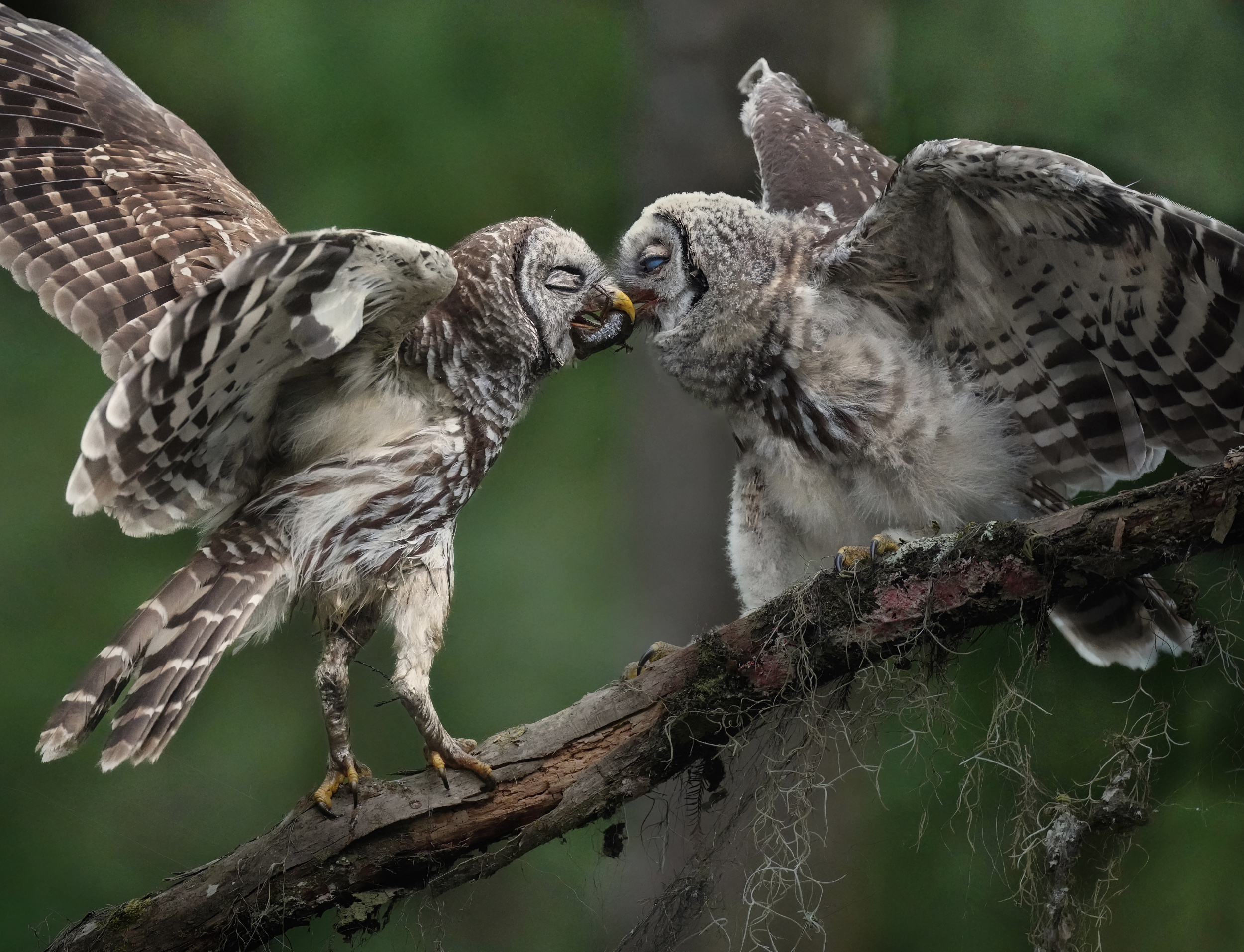
‘The gift’
Who are your favorite photographers or mentors whose work has influenced you, and why?
To name a few: Tin Man Lee, Andy Parkinson, and Federico Veronesi.
As we approach the end of this interview, could you tell us about any photographic projects you'd like to work on?
I plan to explore more conservation projects in the near future.
Is there anything else you would like to add? What are your thoughts on using 1X as a home base for your work?
I find 1X to be an amazing platform where you can view a wide range of carefully and rigorously curated images from all genres. The feedback that the curators provide is invaluable, and viewing other images is deeply inspiring.
I am grateful for this opportunity, including the interview and the curators' expertise, all of which have helped me grow as a photographer.
Thank you so much.
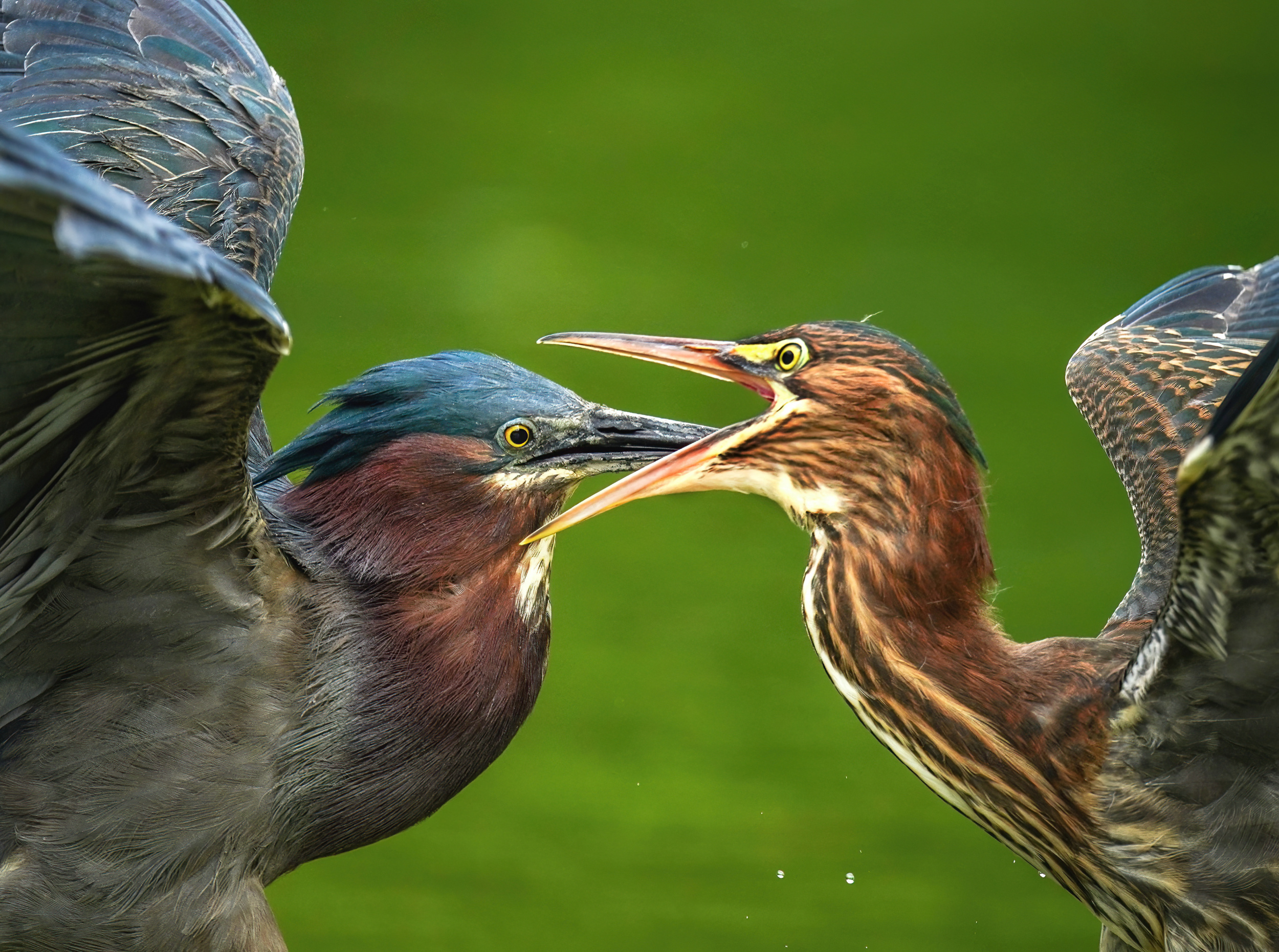
‘Green heron love’
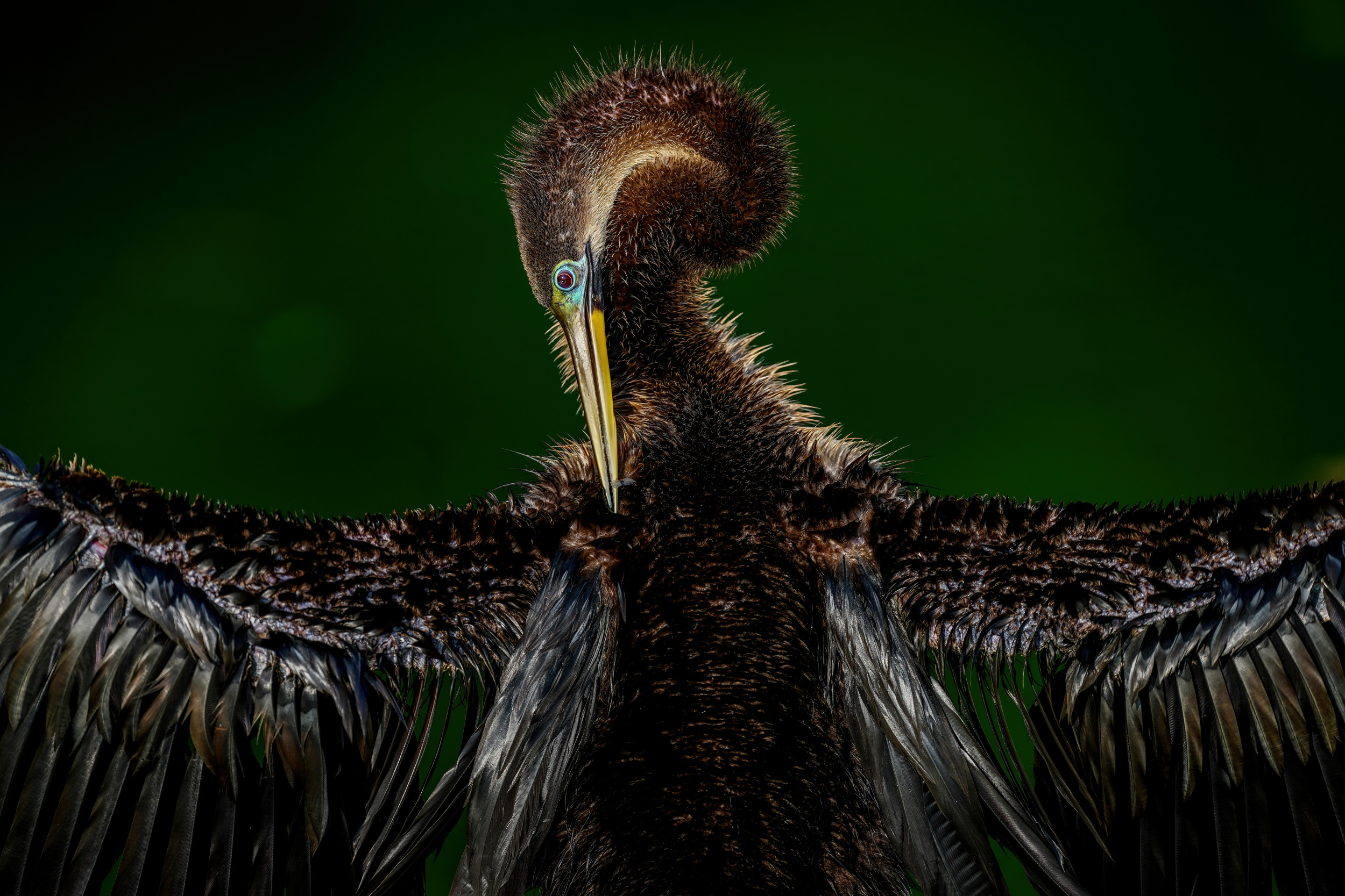
‘Anhinga’
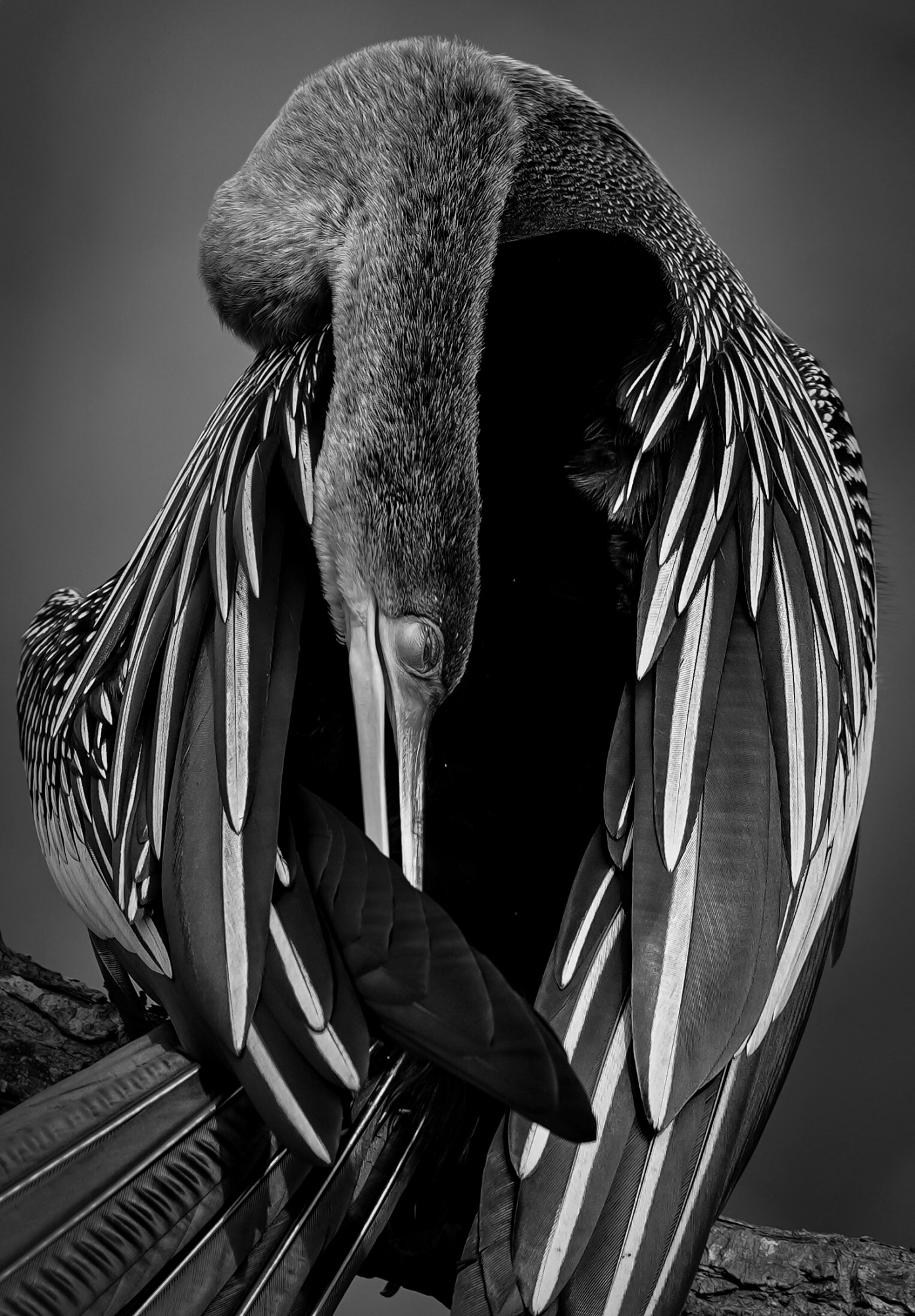
‘Anhinga’
‘The golden catch’
|
| | joanaduenas PRO Wonderful images, congratulations for this impressive and near heart images, I see they are coming from your soul!!! |
 | Cami Marculescu PRO thanks so much |
| | Gila Koller PRO Beautiful gallery with amazing photos!! Congrats!! |
| Cami Marculescu PRO many thanks |
 | Rachel Pansky PRO beautiful, outstanding,wonderful images.Congrats. |
| Cami Marculescu PRO Thanks very much |
 | Ineke Mighorst PRO What a beauty. I love your images. |
| Cami Marculescu PRO Thanks so much |
 | NicoletaPiscoi PRO Spectacular |
| Cami Marculescu PRO many Thanks |
 | Sunil Kulkarni PRO Just Awesome! love all of the images - outstanding - Congrats Cami, keep it up. |
| Cami Marculescu PRO thanks so much |
 | Wonderful, fantastic, amazing, and outstanding images. What more can I say! Congratulations! |
| Cami Marculescu PRO Many thanks , much appreciated |
 | DonnaHom APA PRO |
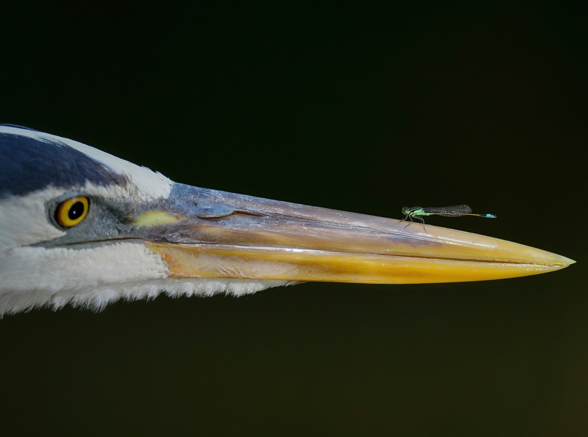
| | DonnaHom APA PRO What a great collection of birds on two generation. The dragonfly landed on the bill of the great lie egret is amazing. |
| Cami Marculescu PRO Thanks so much |
 | Caroline Bomers PRO A beautiful and impressive collection: all images tell stories and express emotions. Congratulations, dear Cami! Thanks also to Yvette. |
| Yvette Depaepe CREW My pleasure, Caroline! |
| Cami Marculescu PRO Thank you very much |
| | Fred Bisschop PRO I like this approach of wildlife photography very much. It shows animals with their behaviour. A bird is not just a beautiful object sitting on a branch but a living animal. Beautiful work! |
| Cami Marculescu PRO Indeed, thank you |
 | Allan Wallberg PRO Many beautiful and fine nature pictures of the birds. |
| Cami Marculescu PRO Thank you |
 | Qin Zhang PRO Very beautiful collection! |
| Cami Marculescu PRO thank you |
 | Andreas Agazzi PRO Such an impressive collection, bravo for this great work! |
| Cami Marculescu PRO many thanks |
| | Eiji Yamamoto PRO Dear Cami, thank you so much for this wonderful interview with great photos! Dear Yvette, thank you so much as always! It's very inspiring! |
| Yvette Depaepe CREW Thanks for your appreciation, Eiji! |
| Cami Marculescu PRO thanks a lot |
 | David Manusevich PRO Very beautiful gallery |
| Yvette Depaepe CREW Thanks for your appreciation, David! |
| Cami Marculescu PRO many thanks |
 | Massimo Strumia PRO Beatiful gallery, congrats! |
| Cami Marculescu PRO Thanks a lot |
 | Great work and great pictures. Congratulations! |
| Cami Marculescu PRO Thanks a lot |
 | Mallal Moshe PRO Excellent |
| Cami Marculescu PRO Thanks a lot |
| | Jane Lyons CREW Cami, your work is wonderful. I so identify with looking through a lens into an owlets eyes as being life changing. Thank you for reminding me. Thanks Yvette. |
| Yvette Depaepe CREW I agree with Jane ... That scene looking into the owlets eyes must have been life changing indeed. |
| Cami Marculescu PRO Indeed , many thanks for the comment and shared experience |
 | Anita Singh PRO Absolutely stunning images and wonderful interview, the connection between subject and photographer is palpable, congratulations dear Cami and wish you more success. Thanks Yuvette for showcasing such an brilliant photographer. |
| Yvette Depaepe CREW My plaisure, dear Anita! |
| Cami Marculescu PRO Thanks so much, I am deeply grateful to Yvette Depaepe for showcasing my work and giving me the opportunity to share my vision and my voice. Thanks so much for your comment. |